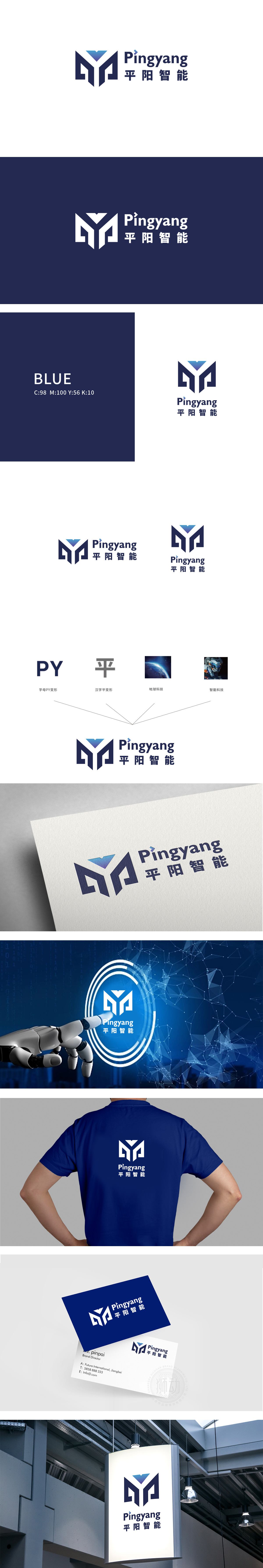
狮动设计以字母“PY”变形,汉字“平”变形:呼应中文品牌名“平阳”,保留文化属性;对称的双结构如同一座稳固的“桥梁”或“基石”,象征品牌的技术实力与可靠性;顶部三角的“向上延伸”则赋予图形动态感,寓意“创新突破”“持续生长”。硬朗的几何线条、蓝色主色调(科技行业经典色)、机甲元素的间接映射(智能科技),共同传递“智能科技”的行业定位。
Lion esign is transformed with the letter "PY" and the Chinese character "ping": it echoes the Chinese brand name "Pingyang" and retains its cultural attributes; Symmetrical double structure is like a stable "bridge" or "cornerstone", which symbolizes the technical strength and reliability of the brand; The "upward extension" of the top triangle gives the graphics a sense of dynamic.


扫码或拨打添加客服微信


