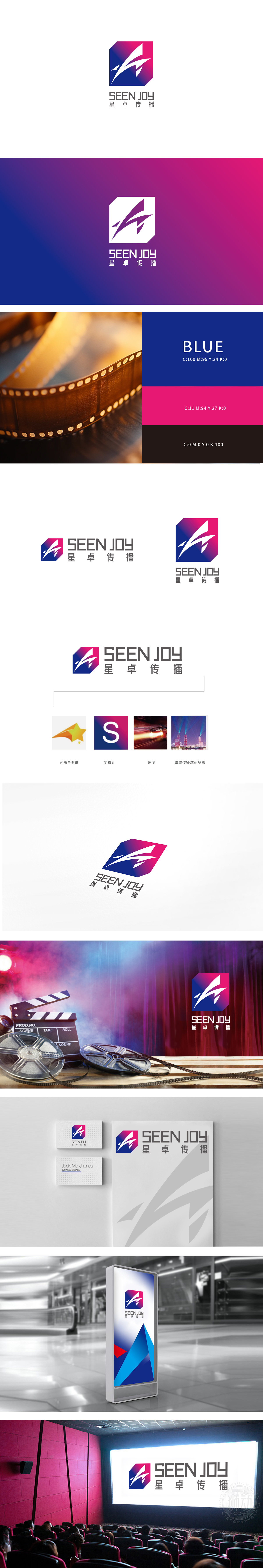
狮动设计以六边形轮廓为基底,五角星变形:橙色五角星的锐角被拉伸为“箭头”形态,既保留了“星”的品牌联想(呼应“星卓”的“星”),又通过倾斜角度赋予其动态感,仿佛流星划过天际,暗合“传播”的扩散属性。字母“S”的抽象化:与五角星的箭头形成方向上的呼应,强化视觉引导性,同时“流线感”暗示传播的顺畅与高效。粉紫渐变到深蓝,既保留了“星空”的梦幻感,又通过冷暖色对比,传递“媒体传播”的多元属性——既有创意的灵动,又有执行的稳重。通过“星(创意)+ S(品牌基因)+ 速度(效率)+ 色彩(多元传播)”的符号系统,精准传递了“星卓传播”作为媒体公司的核心价值——用动态的创意、高效的执行,为客户打造“绚丽多彩”的传播效果。
Lion Design is based on the hexagonal outline, and the five-pointed star is deformed: the acute angle of the orange five-pointed star is stretched into the shape of an arrow, which not only retains the brand association of the star (echoing the star of the star), but also gives it a sense of movement through the oblique angle, as if a meteor crossed the sky, which coincides with the diffusion attribute of "communication". The abstraction of the letter "S": it echoes the arrow of the five-pointed star in the direction of formation, strengthens the visual guidance, and at the same time, the "streamline sense" implies smooth and efficient communication. Pink purple gradually changes to dark blue, which not only retains the dreamy feeling of "starry sky", but also conveys the multiple attributes of "media communication" .


扫码或拨打添加客服微信


