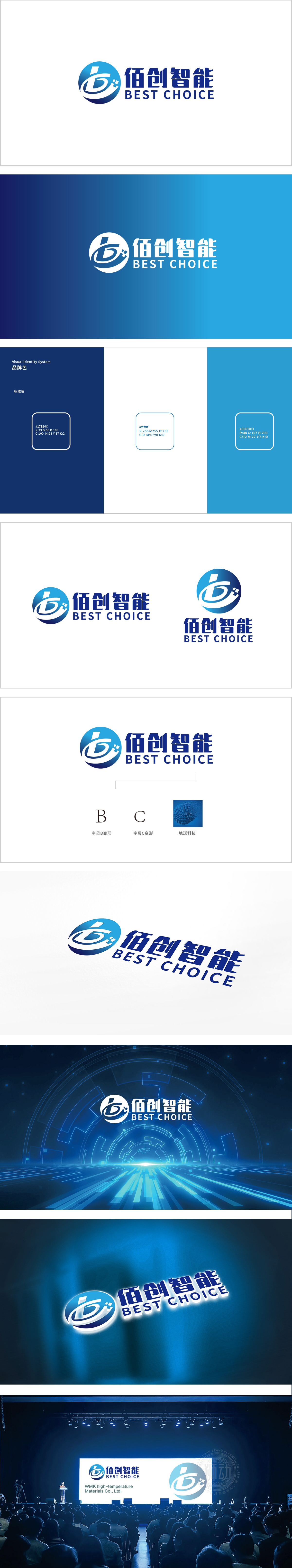
狮动设计以 圆形轮廓内嵌抽象化的“b”字母,线条采用流畅的曲线与几何切割结合,既保留了字母的识别性,又通过向右上方延伸的笔触形成“上升趋势”的视觉动势,隐喻品牌在智能科技领域的创新突破与前瞻性。圆形背景象征全球化视野与完整的技术闭环,蓝色渐变从深到浅的过渡则传递出电子科技的理性、专业与未来感,符合家电行业对“智能、可靠”的品牌调性需求。LOGO通过“显性符号(蓝色科技感、无衬线字体)+隐性关联(像素元素、动态线条)”的双重设计逻辑,精准捕捉了电子家电行业的核心特质:传递了品牌的可靠与温度。
Lion design embeds the abstract letter "B" in a circular outline, and the lines are combined with smooth curves and geometric cuts, which not only retains the recognition of letters, but also forms an "upward trend" visual momentum through strokes extending to the upper right, which symbolizes the brand's innovative breakthrough and forward-looking in the field of intelligent technology. The circular background symbolizes the global vision and the complete closed-loop technology, while the transition of the blue gradient from deep to shallow conveys the rationality, professionalism and futurity of electronic technology, which meets the brand tonality demand of "intelligence and reliability" in the home appliance industry.


扫码或拨打添加客服微信


