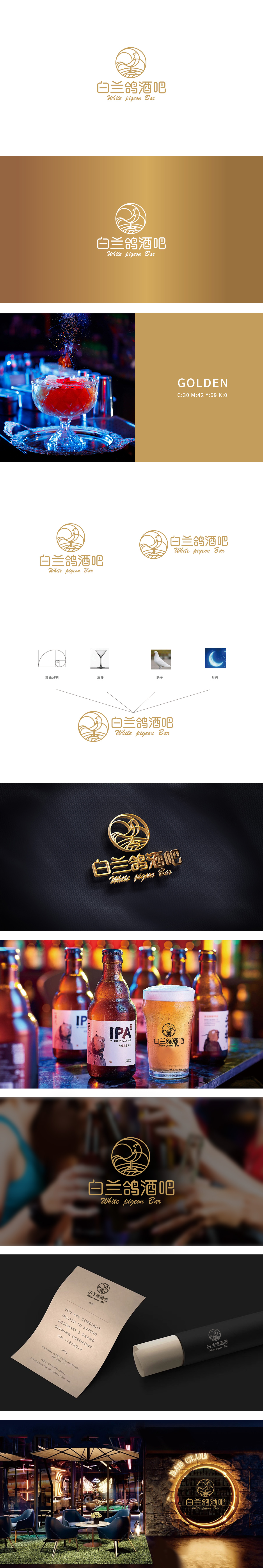
狮动设计以线条勾勒出一只站立的白鸽,嵌套于正圆形轮廓中。线条流畅且富有节奏感——白鸽的头部微微扬起,喙部尖细指向右上方,翅膀以弧形收束,尾部与腹部线条自然衔接,形成“静态中暗含动态”的视觉张力。圆形轮廓既象征完整、包容的空增强了画面的层次感,白鸽脚下的线条被处理为类似“波浪纹”或“地面起伏”的形态,既暗示了白鸽站立的稳固感,又通过曲线柔化了整体轮廓,与白鸽的轻盈形成对比,传递出“在静谧中感受自由”的氛围——这与酒吧希望营造的放松、舒适场景高度契合。整体通过对线条、符号、色彩的精准把控,让品牌理念“润物细无声地”渗透到视觉中,堪称商业设计中“以简驭繁”的典范。
Lion design outlines a standing white dove with lines, nested in a circular outline. The lines are smooth and rhythmic-the white dove's head is slightly raised, its beak is pointed upward to the right, its wings are gathered in an arc shape, and its tail is naturally connected with the abdominal lines, forming a visual tension of "static implies dynamic". The circular outline not only symbolizes the complete and inclusive emptiness, but also enhances the layering of the picture. The lines under the pigeon's feet are treated as "wavy lines" or "ground ups and downs", which not only implies the stability of the pigeon's standing, but also softens the overall outline through curves, which contrasts with the lightness of the pigeon and conveys the atmosphere of "feeling free in silence".


扫码或拨打添加客服微信


