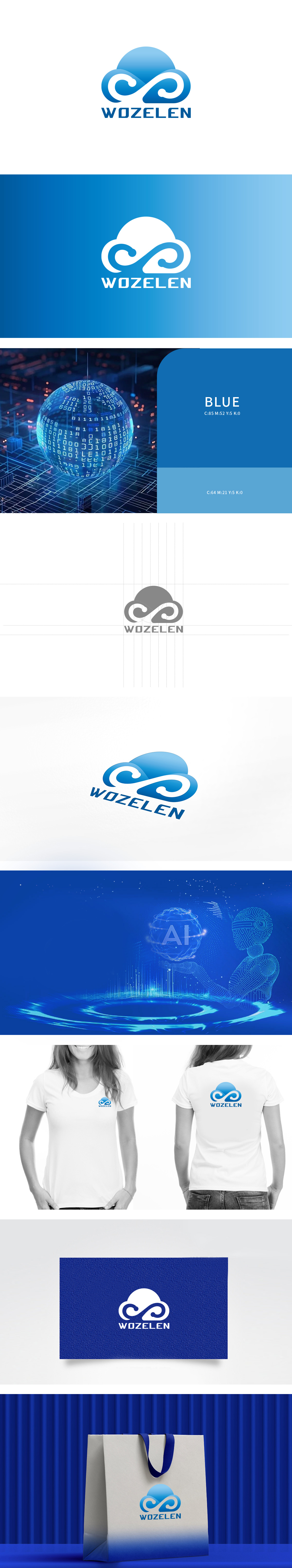
狮动设计以渐变蓝色为主色调,既传达了科技行业的专业与可靠,又通过云朵的造型传递出轻量、互联的意象,而中间巧妙融入的“∞”(无限符号)元素,既象征数据与技术的无限可能,也让图形更具记忆点和延展性。字体设计简洁有力,与图形部分形成很好的平衡,整体风格现代且富有动感,确实能感受到设计者在科技属性与视觉美学结合上的巧思,展现了对品牌核心价值的精准提炼。
Lion design takes the gradient blue as the main tone, which not only conveys the professionalism and reliability of the science and technology industry, but also conveys a light and interconnected image through the modeling of clouds. The ∞ (infinite symbol) element skillfully integrated in the middle not only symbolizes the infinite possibilities of data and technology, but also makes the graphics more memorable and extensible. The font design is concise and powerful, which forms a good balance with the graphic part. The overall style is modern and dynamic.


扫码或拨打添加客服微信


