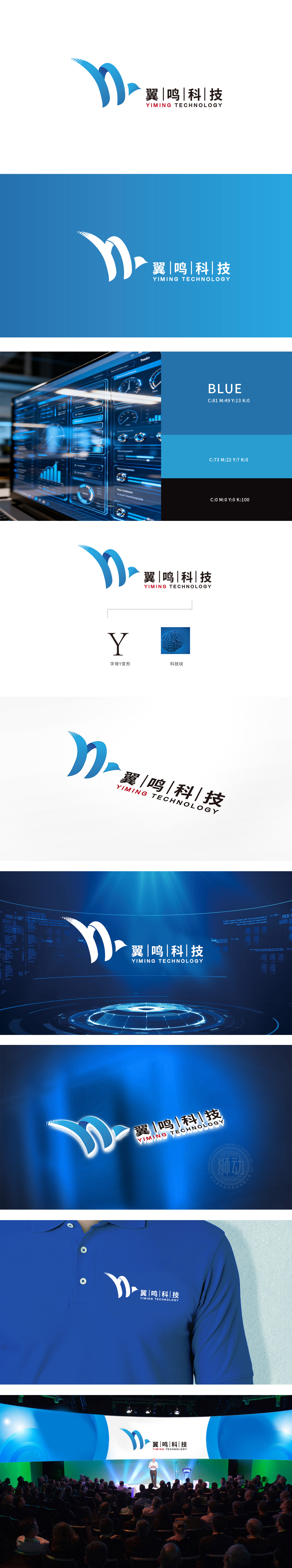
狮动设计由两道流畅的蓝色曲线构成,左侧曲线如向上扬起的羽翼,右侧曲线与之呼应形成环抱感,整体呈现“Y”字形态,曲线构成的“羽翼”形态,直观呼应“翼鸣”的“翼”,象征品牌助力客户“展翅高飞”(技术赋能)、突破行业壁垒;同时,“翼”的舒展感也可联想为“数据传输”“信息流动”,贴合科技公司的技术服务属性,主色调蓝色:选取深邃且明亮的蓝,传递科技感、专业性与信任感,符合科技公司的行业属性;。通过“动态图形+科技色彩+结构化文字”的组合,成功构建了兼具行业属性与品牌个性的视觉符号:图形的“翼”与“鸣”双重意象,既贴合科技行业的“赋能”“连接”需求,又传递出品牌的创新与活力。
Lion design consists of two smooth blue curves, the left curve is like a wing that rises upward, and the right curve echoes it to form a sense of embracing, showing a "Y" shape as a whole. The "wing" shape formed by the curve directly echoes the "wing" of "wing", symbolizing that the brand helps customers "fly high" (technical empowerment) and break through industry barriers; At the same time, the stretch of "wing" can also be associated with "data transmission" and "information flow", which fits the technical service attributes of technology companies. The main color is blue: deep and bright blue is selected to convey the sense of technology, professionalism and trust.


扫码或拨打添加客服微信


