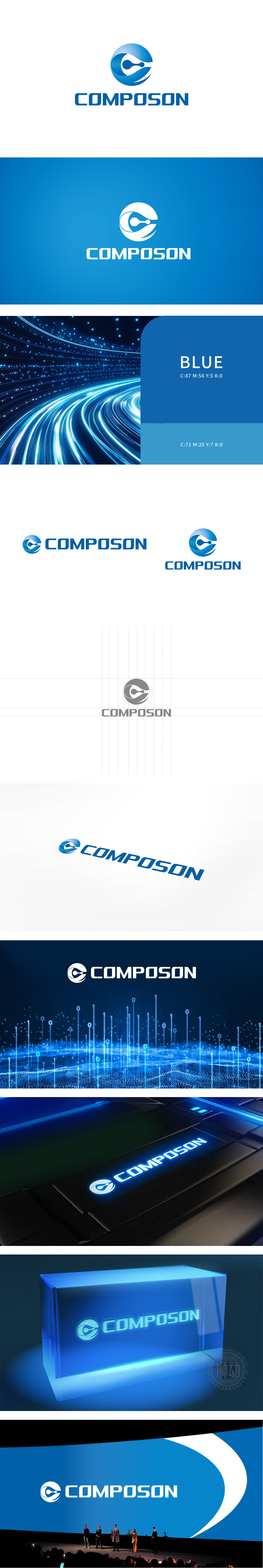
狮动设计采用蓝色渐变的圆形轮廓既象征“电子/科技领域”的全球化视野,也暗含数据闭环或系统完整性;内部抽象的“C”形曲线与水滴状图形组合,形似芯片电路的流动感、数据流的传输轨迹,科技蓝传递出理性、可靠、创新的行业气质,符合电子技术领域对精度和信任感的需求,同时蓝色的包容性也为品牌未来拓展留出联想空间。通过“流动的图形+稳重的字体”传递“技术驱动、精准分析”的核心价值,这为“COMPOSON”未来在图形分析电子领域的多元化发展。
Lion design adopts a circular outline with blue gradient, which not only symbolizes the global vision of "electronics/technology field", but also implies data closed loop or system integrity; The combination of the internal abstract "C"-shaped curve and the water-drop-shaped graph is similar to the fluidity of the chip circuit and the transmission track of the data stream. The technology blue conveys a rational, reliable and innovative industry temperament, which meets the demand for precision and trust in the field of electronic technology. At the same time, the inclusiveness of blue also leaves room for association for the future expansion of the brand.


扫码或拨打添加客服微信


