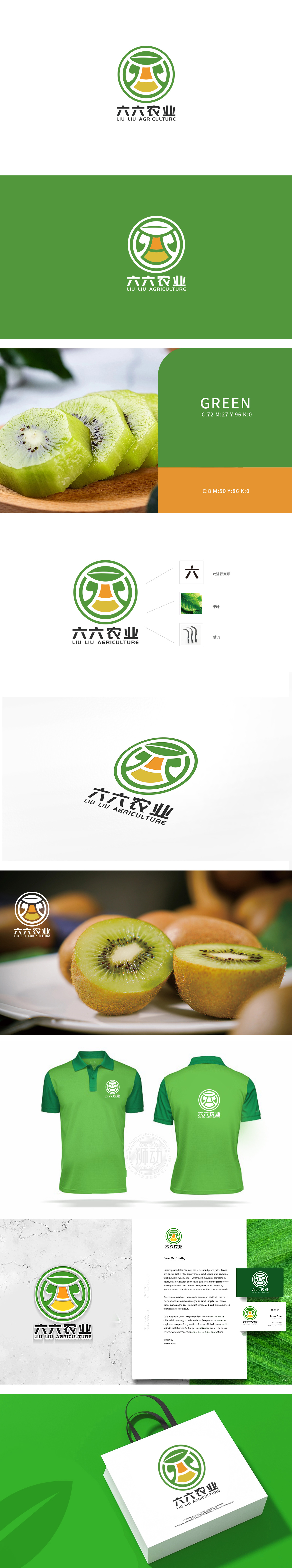
狮动设计采用圆形轮廓,内部由几何线条与色块构成抽象图形,“六”字的意象化变形:既点明“六六农业”的品牌名称,又通过线条的圆润处理,增强亲和力。绿叶与自然的象征:绿色作为主色调贯穿整体,形成“叶-果”的视觉联想,直接关联农业的“自然、生态”属性。镰刀的抽象化融入,既体现农业生产的行业特性,又通过极简设计避免工具符号的沉重感,转而传递“耕耘、收获”的积极意象。通过对“六”字、自然元素、农具的抽象化重组,构建了一个兼具品牌专属性(数字“六”的贯穿)与行业通识性(绿色、收获意象)的标志。
Lion design is a circular outline, and the interior is an abstract figure composed of geometric lines and color blocks.The image deformation of the word "Liu": it not only points out the brand name of "Liu Liu Agriculture", but also enhances the affinity through the rounded treatment of lines. The symbol of green leaves and nature: green, as the main color, runs through the whole, forming a visual association of "leaves and fruits", which is directly related to the "natural and ecological" attributes of agriculture.The abstract integration of sickle not only embodies the industrial characteristics of agricultural production, but also avoids the heavy feeling of tool symbols through minimalist design.


扫码或拨打添加客服微信


