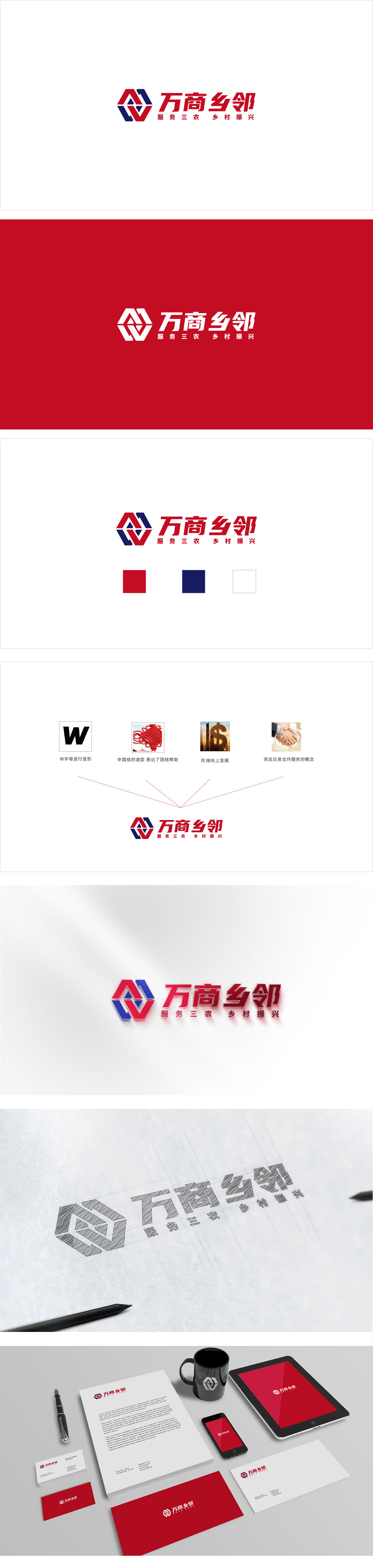
狮动设计用几何语言讲农业故事,红蓝菱形组合,是整个logo的“视觉锚点”:从形态上看,它像农田的阡陌网格,也像连接的桥梁,还暗含向上的箭头(乡村振兴的发展趋势)。这种“一形多义”的设计,既保留了农业的传统符号,又传递了“平台连接、赋能发展”的现代理念。菱形的对称结构,象征稳定与可靠,符合“服务三农”的信任感;红蓝两色的交错,像“商家”与“乡邻”的互动,呼应“万商乡邻”的名字。 整体通过“现代感”传递了“农业也能很时尚、很有活力”。用现代商业思维赋能传统农业,用科技连接万商与乡邻,让乡村振兴“看得见、摸得着”。
Lion design tells agricultural stories in geometric language, and the combination of red and blue diamonds is the "visual anchor point" of the whole logo: from the morphological point of view, it is like a grid of farmland, as well as a connecting bridge, and it also implies an upward arrow (the development trend of rural revitalization). This "ambiguous" design not only retains the traditional symbols of agriculture, but also conveys the modern concept of "platform connection and empowerment development". The diamond-shaped symmetrical structure symbolizes stability and reliability and accords with the trust of "serving agriculture, countryside and farmers"; The alternation of red and blue, like the interaction between "merchants" and "rural neighbors", echoes the name of "Wanshang rural neighbors".


扫码或拨打添加客服微信


