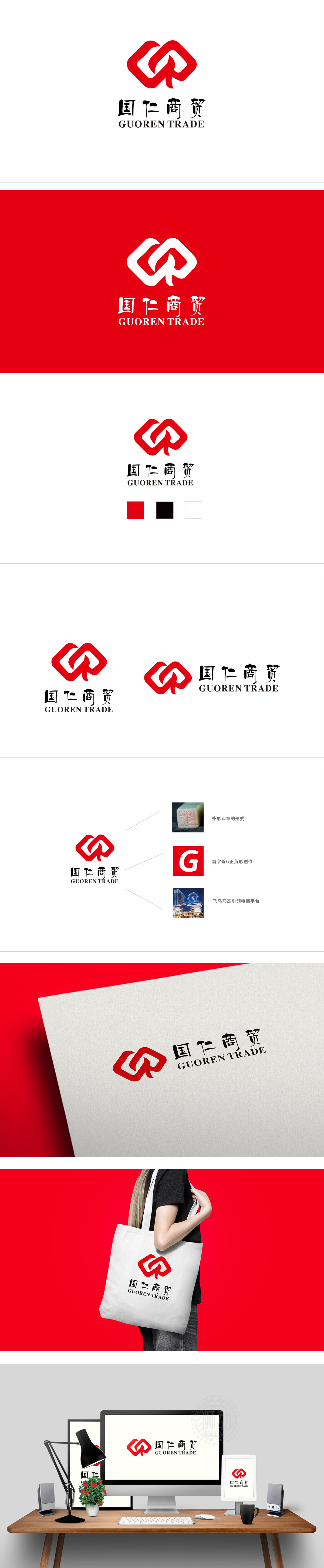
狮动设计借鉴印章的形式美感(方正轮廓、厚重线条),呼应商贸企业“稳重、可信”的底层需求,同时暗合“国仁”二字中“家国情怀”的传统内涵,为品牌注入文化厚重感;现代电商的活力:提炼飞鸟的动态形态(流畅曲线勾勒展翅姿态),象征电商平台“快速、便捷、引领”的行业属性,传递“转型创新”的品牌主张;通过首字母“G”的正负形创作),将抽象的字母转化为具有视觉记忆点的图形——负形的留白与正形的红色形成强烈对比,既突出了品牌的专属身份,又让logo更具层次感与现代感。整体通过巧妙的形式转化,让logo既“好看”又“好懂”,既“有记忆点”又“有情感共鸣”。
Lion design draws lessons from the formal aesthetic feeling (square outline and thick lines) of seals, echoes the bottom needs of commercial enterprises to be "stable and credible", and at the same time coincides with the traditional connotation of "feelings for home and country" in the word "national benevolence", injecting a strong sense of culture into the brand; The vitality of modern e-commerce: refine the dynamic form of birds (smooth curve outlines the posture of spreading wings), symbolize the industry attribute of e-commerce platform "fast, convenient and leading", and convey the brand proposition of "transformation and innovation"; Through the positive and negative creation of the initial "G", the abstract letters are transformed into graphics with visual memory points-the blank space of the negative shape is in sharp contrast with the red color of the positive shape.


扫码或拨打添加客服微信


