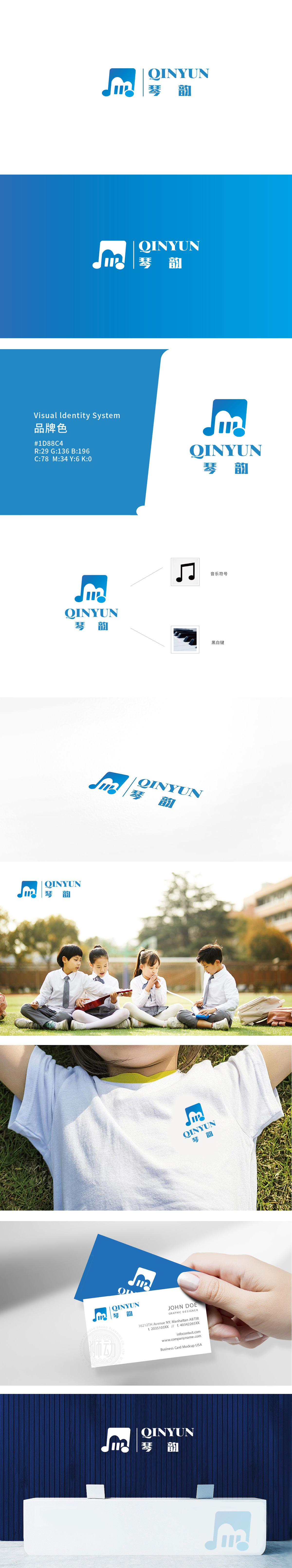
狮动设计以音符轮廓为基础,顶部曲线模拟五线谱中的音符符头,三条竖线既像琴弦的抽象简化,赋予其琴弦的韵律感。底部的圆点元素则类似音符的符尾或琴弦的固定点,整体形成“音中有琴,琴中带音”的视觉联想,直观传递“琴韵”的音乐属性。蓝色主调传递沉稳、优雅的气质,强化了品牌的专业与文化底蕴。整体将“琴”(乐器)、“韵”(声音、韵律)这两个抽象概念,通过“音符+琴弦”的视觉符号具象化,将音乐与文化的视觉浓缩在图形中。
Lion design is based on the outline of the note, and the top curve simulates the note Fu Tou in the staff. The three vertical lines are not only like the abstract simplification of the strings, but also give them a sense of rhythm. The dot elements at the bottom are similar to the endings of notes or the fixed points of strings, forming a visual association of "there is a piano in the sound and there is a sound in the piano" as a whole, and intuitively conveying the musical attribute of "musical rhyme".


扫码或拨打添加客服微信


