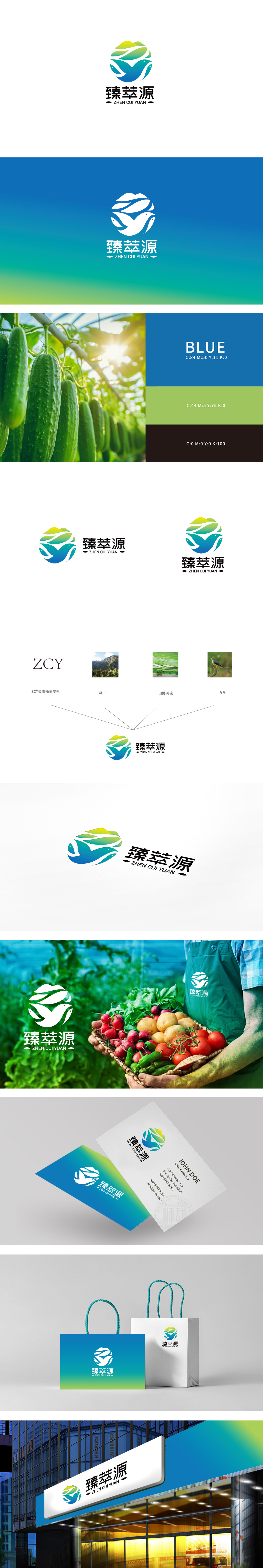
狮动设计以圆形为基底,内部由多片渐变叶片环绕而成,叶片线条流畅且富有动感,既象征生鲜产品的“自然属性”,又通过叶片层叠形成的包裹感,传递“汇聚、精选”的品牌理念。叶片间穿插的白色曲线巧妙勾勒出飞鸟或游鱼的轮廓,暗合生鲜品类中的多元覆盖,同时通过具象化的自然生物传递“鲜活、原生”的产品特性。通过“自然元素具象化)+ 色彩品类关联+ 符号隐喻的设计逻辑,精准传递了“精选全球优质生鲜,强调新鲜、健康、多元”的品牌核心价值。
Lion design is based on a circle, and its interior is surrounded by a number of gradual blades. The blades are smooth and dynamic, which not only symbolizes the "natural attribute" of fresh products, but also conveys the brand concept of "gathering and selecting" through the sense of wrapping formed by overlapping blades. The white curves interspersed among the leaves skillfully outline the outline of birds or fish, which coincides with the multiple coverage in fresh products, and at the same time, the product characteristics of "fresh and original" are transmitted through figurative natural creatures.


扫码或拨打添加客服微信


