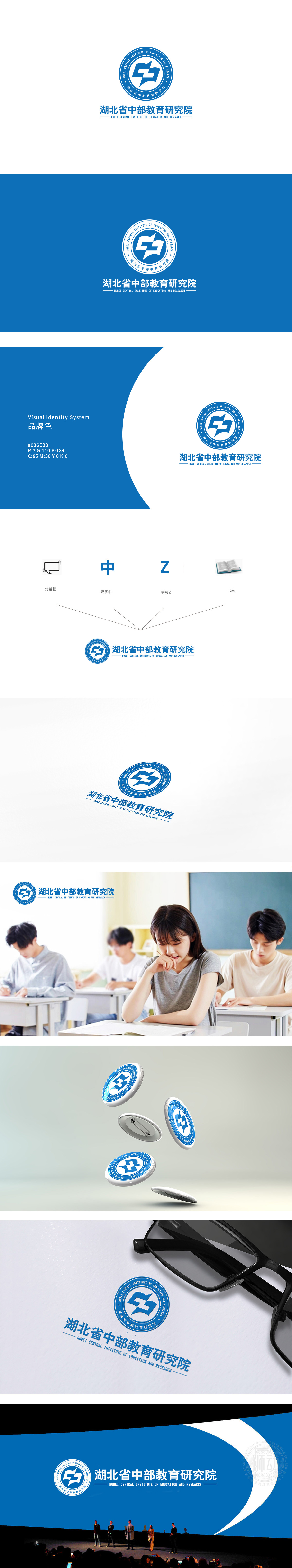
狮动设计采用圆形徽章设计,外圈环绕中英文名称,内圈为核心图形与机构简称,这种对称结构传递出正式、权威的气质,符合研究院的学术定位。圆形轮廓象征完整、包容,也寓意教育研究的系统性与持续性。两个蓝色几何色块交叉组合而成,暗含“互”字结构(互动、交流),同时整体呈现向上的箭头动态,隐喻教育研究的“探索精神”与“创新突破”。翻开的书页,象征知识的传播与积累;展翅的飞鸟或向上的阶梯,寓意成长、发展与前瞻性。整体通过符号化图形、经典徽章结构、专业色彩体系,成功将“教育研究”的抽象概念转化为可感知的视觉语言。
Lion design adopts circular badge design, with the outer ring surrounding Chinese and English names, and the inner ring being the core figure and organization abbreviation. This symmetrical structure conveys a formal and authoritative temperament and conforms to the academic orientation of the Institute. The circular outline symbolizes completeness and tolerance, and also implies the systematicness and continuity of educational research. The combination of two blue geometric color blocks implies the word "mutual" structure (interaction and communication), and at the same time, it shows the upward arrow dynamics as a whole.


扫码或拨打添加客服微信


