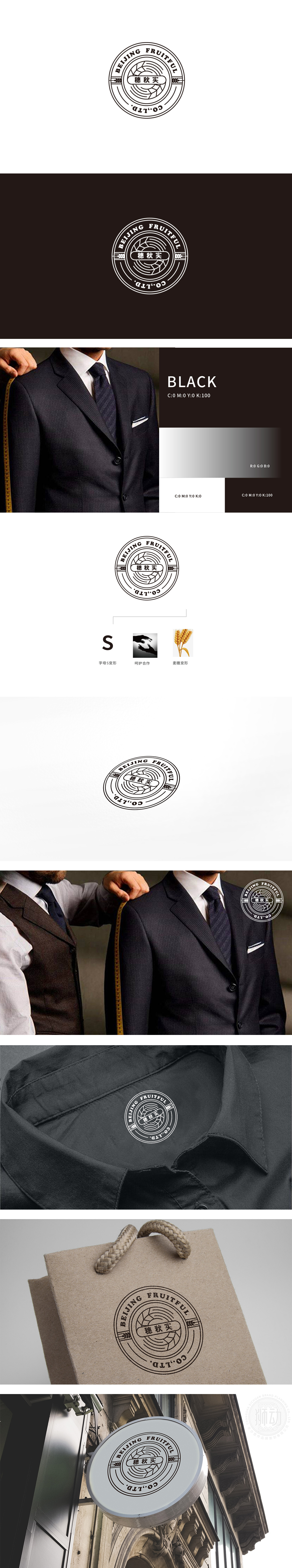
狮动设计采用圆形徽章结构,以放射状线条和麦穗元素为主视觉,中间嵌入中文“穗秋实”,明确传递出品牌与农产品的行业属性,强调自然、原生态的价值主张;中心的放射线条从内向外扩散,形似阳光或麦浪的动态感,既增强了视觉张力,又隐喻“硕果累累”“能量辐射”的积极意象,整体以“符号隐喻+文字直述”的双重手法,将品牌名称、行业属性与视觉美感高度融合,呈现经典、稳重的复古感,传递出品牌历史感和信赖感。
Lion design adopts a circular badge structure, with radial lines and wheat ear elements as the main vision, and Chinese "ear and autumn fruit" embedded in the middle, which clearly conveys the industrial attributes of brands and agricultural products and emphasizes the value proposition of nature and original ecology; The radial lines in the center spread from the inside to the outside, resembling the dynamic feeling of sunshine or wheat waves.


扫码或拨打添加客服微信


