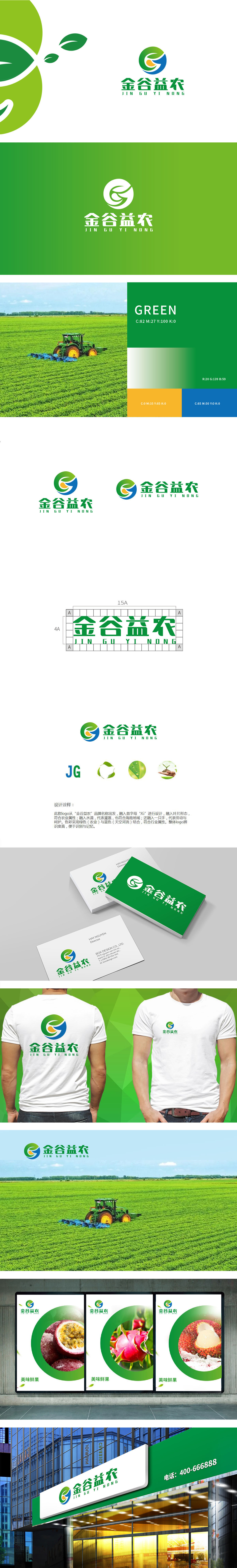
狮动设计通过品牌首字母“JG”为骨架,巧妙融入叶片形态,直观传递农业的自然属性;水滴元素既象征灌溉对农作物的滋养,又贴合海南地域的水系特色,体现因地制宜的农业理念;“手”的意象则强化了“劳动创造”与“用心呵护”的品牌温度,整体将将抽象的农业概念(如地域、劳动、生态、灌溉)转化为具象的视觉符号,围绕“益农”的核心价值(滋养、劳动、守护)形成有机整体,用视觉语言讲好农业故事”。
Lion design takes the brand initials "JG" as the skeleton, skillfully blends into the leaf shape, and intuitively conveys the natural attributes of agriculture; Water drop element not only symbolizes the nourishment of irrigation to crops, but also conforms to the characteristics of water system in Hainan, reflecting the agricultural concept of adapting to local conditions; The image of "hand" strengthens the brand temperature of "labor creation" and "care with heart", which will transform abstract agricultural concepts (such as region, ecology and irrigation) into concrete visual symbols.


扫码或拨打添加客服微信


