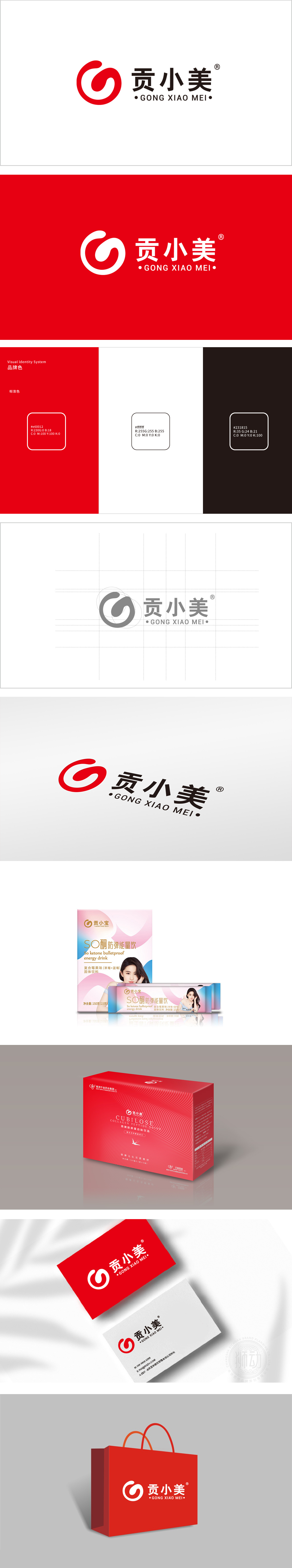
狮动设计采用抽象的“美”字首字母“M”的变形,暗合人体循环、活力提升等健康意象。红色作为主色调,通常传递热情、能量与生命力,与保健品行业追求“健康、活力”的核心价值相契合。中文“贡小美”字体简洁稳重,“贡”字暗含“品质优良、精选”的寓意,“小美”则传递亲切、贴近生活的品牌定位,红色的活力感与螺旋上升的形态,间接呼应了健康产业“积极向上、持续赋能”的产品理念。
Lion design adopts the deformation of the abstract "beauty" initials "m", which coincides with the healthy images such as human circulation and vitality improvement. As the main color, red usually conveys enthusiasm, energy and vitality, which is consistent with health care industry's core value of pursuing "health and vitality". The Chinese font "Gong Xiaomei" is simple and steady. The word "Gong" implies the meaning of "excellent quality and excellent selection", while "Xiaomei" conveys a kind and close-to-life brand positioning. The red sense of vitality and spiraling form indirectly echo the product concept of "positive and continuous empowerment" in the health industry.


扫码或拨打添加客服微信


