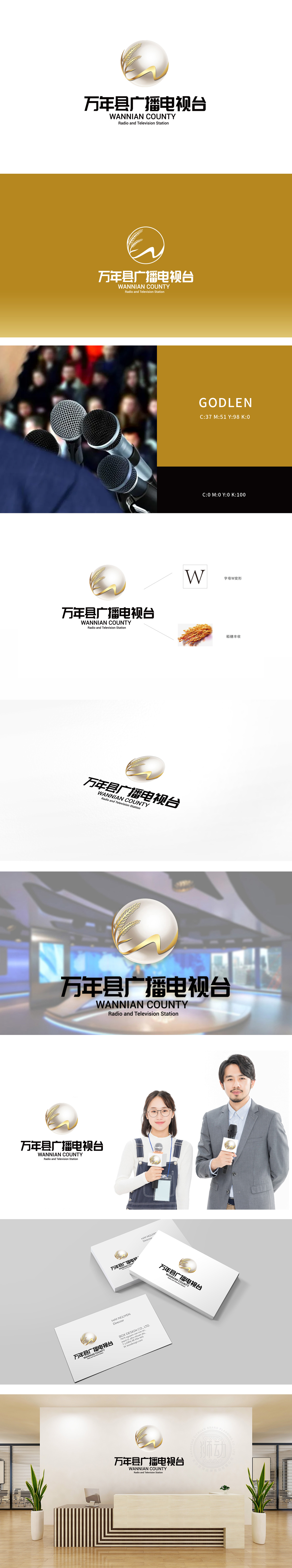
狮动设计以白色半透明球体为主体,球体象征“地球”“全球视野”,也隐喻媒体的包容性与信息传播的广度。球体左侧的两束金色麦穗是设计的核心意象,直接关联“万年县”的地域特色,麦穗是其农耕文明与历史底蕴的象征,传递出“扎根本土、传承文化”的寓意。线条如“电波”般灵动,既象征广播电视的信号传播属性,也以飘逸的形态中和了麦穗的厚重感,体现媒体的“连接”与“传播”功能。整体以极简图形承载丰富内涵,麦穗+飘带+球体的组合,兼顾“地域文化”“传播功能”“权威形象”三重维度;精准塑造了万年县广播电视台“扎根本土、传播文明、连接世界”的品牌形象。
Lion design takes the white translucent sphere as the main body, which symbolizes the "earth" and "global vision" and also symbolizes the inclusiveness of the media and the breadth of information dissemination. The two golden ears of wheat on the left side of the sphere are the core images of the design, which are directly related to the regional characteristics of "Wannian County", and the ears of wheat are the symbols of its farming civilization and historical heritage, conveying the meaning of "taking root in the local area and inheriting culture". The lines are as agile as "radio waves", which not only symbolizes the signal transmission attribute of radio and television.


扫码或拨打添加客服微信


