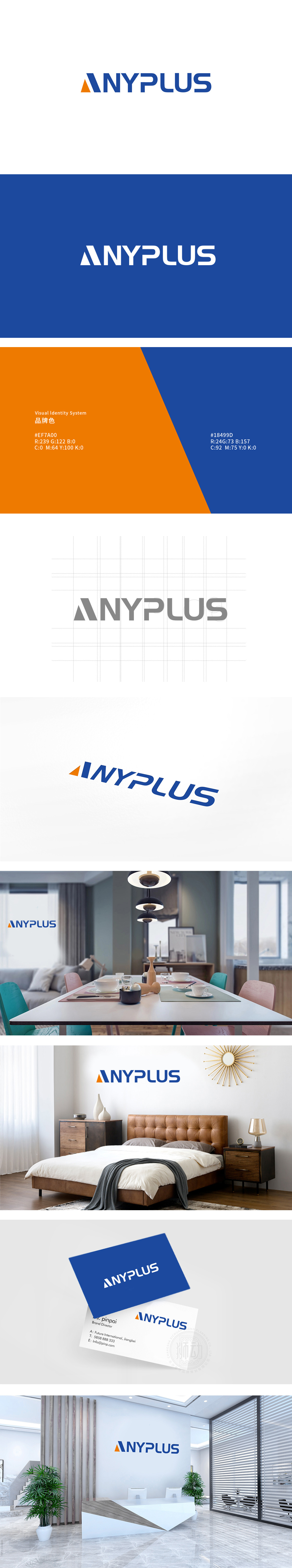
狮动设计以简洁现代的图形符号与品牌名称组合呈现,图形为橙色三角形与蓝色斜向条形的叠加设计,三角形(橙色):象征稳定、突破与活力,锐角设计传递进取感,橙色作为暖色调,增强视觉焦点与亲和力,适合家居场景中对温馨氛围的需求。蓝色条形(深蓝色):与三角形形成交叉结构,线条硬朗且富有延伸感,既平衡了橙色的跳跃感,又隐喻“连接”“扩展”,该标志通过理性的结构设计与感性的色彩搭配,成功传递了“专业、现代、温暖”的品牌形象。
Lion design is presented by the combination of concise and modern graphic symbols and brand names. The graphic is the superposition design of orange triangle and blue diagonal bar. The triangle (orange) symbolizes stability, breakthrough and vitality. The acute angle design conveys enterprising feeling, and orange is used as a warm tone to enhance visual focus and affinity, which is suitable for the demand of warm atmosphere in home scenes. Blue bar (dark blue): It forms a cross structure with triangle, and the lines are tough and full of extension.


扫码或拨打添加客服微信


