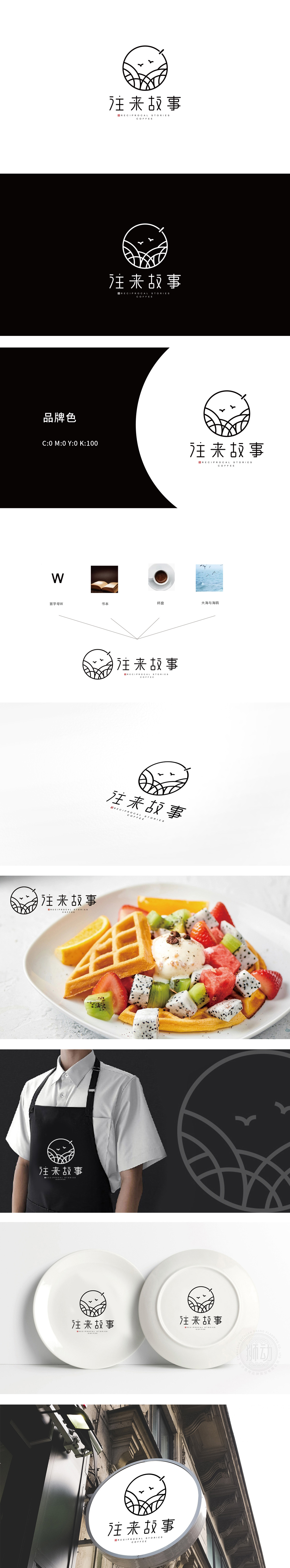
狮动设计以首字母“W”:其线条被抽象为标识底部的“汇聚折线”,又通过“V型分叉”隐喻“往来”的双向互动关系(如人与人、人与空间的连接)。书本×杯盘:通过“线条汇聚”融入品牌内核——将“消费场景”升华为“情感载体”,暗示顾客在此不仅是用餐,更是“阅读故事、创造故事”的过程。海浪波纹被提炼为标识圆形中的“抽象线条”,海鸥则简化为两只飞鸟剪影,与品牌名“往来”形成呼应(如海鸥往返于海面,暗喻“人来人往”的流动感),同时通过开阔的自然意象消解餐饮空间的商业属性,赋予其“松弛、治愈”的氛围。整体以圆形作为“无边界”的符号,既代表“完整的故事”,也暗示“开放的空间”,传递“每个人既是故事的讲述者,也是倾听者”的品牌主张。
Lion design starts with the initial letter "W": its lines are abstracted as the "convergence polyline" at the bottom of the logo, and the "V-shaped bifurcation" is a metaphor for the two-way interaction between people (such as the connection between people and space). Books × cups and plates: integrating into the core of the brand through "line convergence"-subliming "consumption scene" into "emotional carrier", suggesting that customers are not only dining here, but also "reading stories and creating stories". Wave ripples are refined into "abstract lines" in the logo circle, while seagulls are simplified as the silhouette of two birds, which echoes the brand name "going back and forth" (for example, seagulls go back and forth on the sea, implying the sense of mobility of "people coming and going"), and at the same time, the commercial attributes of dining space are dispelled through open natural images, giving it a "relaxed and healing" atmosphere.


扫码或拨打添加客服微信


