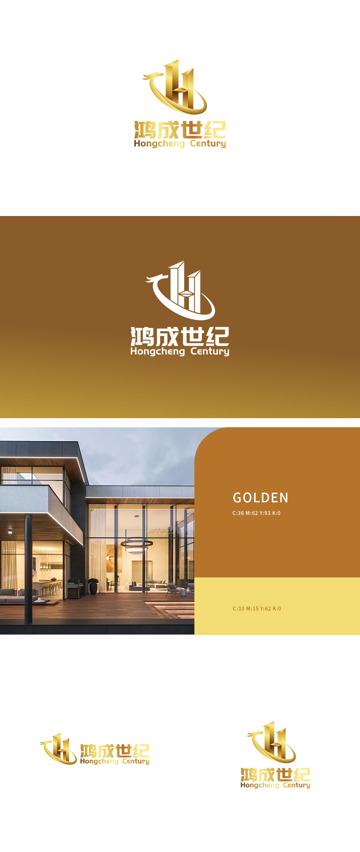
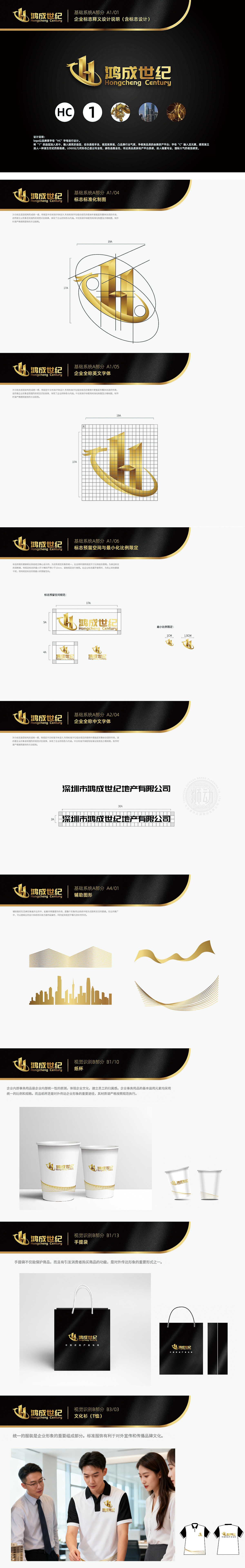
狮动设计通过“鸿”字首字母“H”与龙形曲线构成,形成“字中有形、形中有意”的双重符号体系:字母“H”的结构化表达: 以金色立体几何形态呈现,左右两侧的挺拔竖线与中间横向连接部分,形成“稳定的三角结构”,强化了“世纪”所蕴含的基业长青、坚实可靠的品牌气质,龙形曲线的文化隐喻: 既呼应“鸿”字(鸿雁、鸿鹄)所代表的高远志向,又通过龙的祥瑞意象传递权威与尊贵,实现“现代企业”与“传统文化”的符号嫁接。最终呈现出一个既“看得懂”(识别性强)又“有话说”(文化内涵丰富)的品牌视觉符号。
Lion Design consists of the initial letter "H" of "Hong" and the dragon-shaped curve, forming a dual symbol system of "tangible in the word and intentional in the shape": the structural expression of the letter "H" is presented in a golden three-dimensional geometric form, and the vertical lines on the left and right sides and the horizontal connection part in the middle form a "stable triangle structure", which strengthens the brand temperament of "Century" with a long history and solid reliability. Finally, it presents a brand visual symbol that is both "understandable" (strong recognition) and "meaningful" (rich in cultural connotation).


扫码或拨打添加客服微信


