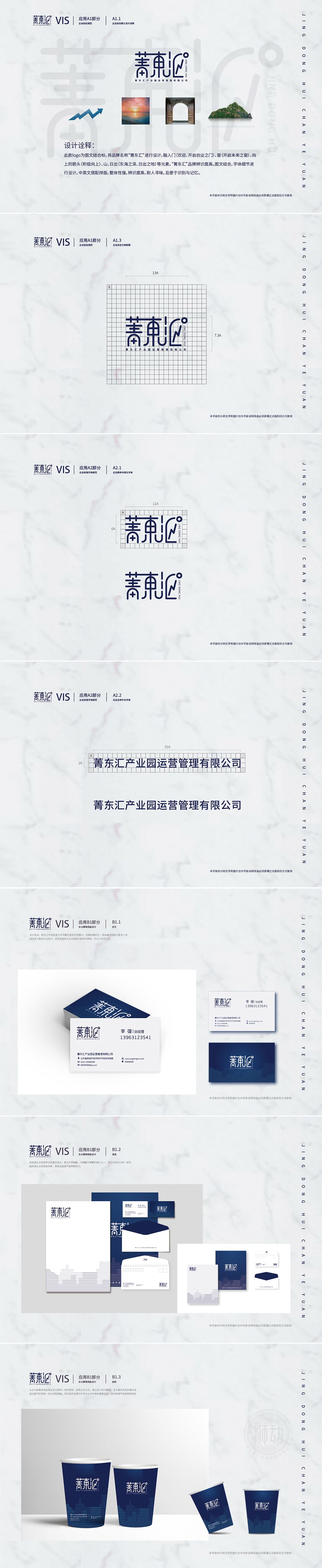
狮动设计以“菁”字的横纵线条、“东”字的“田”字格,联想为产业园的建筑轮廓、园区规划的网格结构,直观传递“产业园运营管理”的核心业务属性。汇聚与连接:“汇”字的开放曲线+闪电符号,隐喻“资源汇聚”“高效链接”,契合“汇”字的字面含义,同时“闪电”象征创新、活力,暗示产业园对企业发展的赋能作用。整体字形从左至右呈现“稳定(菁)—核心(东)—开放(汇)”的递进关系,暗合“菁东汇”从“打造核心平台”到“汇聚资源”再到“开放共赢”的品牌发展路径,图形与品牌战略形成深度绑定。整体呈现“开放包容、动态发展”的态势。
Lion Design uses the horizontal and vertical lines of the word "Jing" and the word "Tian" of the word "East", and Lenovo is the architectural outline of the industrial park and the grid structure of the park planning, which intuitively conveys the core business attributes of "industrial park operation management". Convergence and connection: the open curve of the word "Hui"+lightning symbol is a metaphor for "resource convergence" and "efficient link", which fits the literal meaning of the word "Hui". At the same time, "lightning" symbolizes innovation and vitality, suggesting the empowerment of industrial parks for enterprise development. From left to right, the overall glyph presents a progressive relationship of "stability (Jing)-core (East)-openness (Hui)".


扫码或拨打添加客服微信


