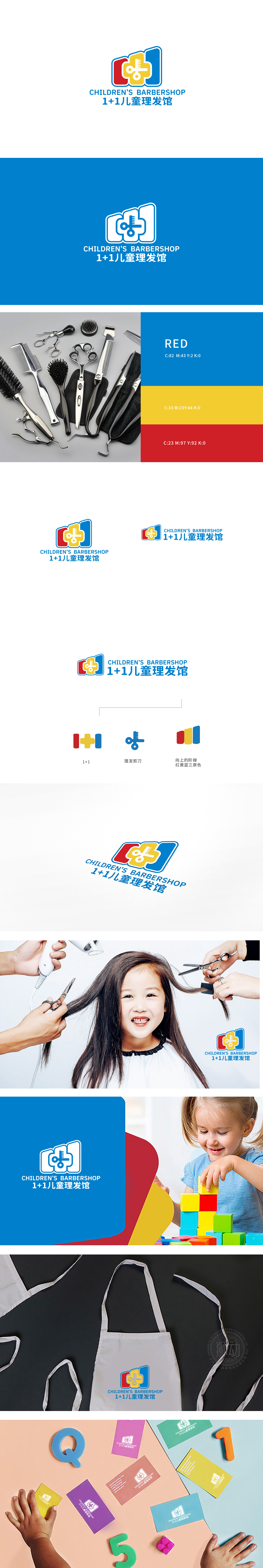
狮动设计采用剪刀+梳子的组合图标,通过简洁的线条勾勒出工具形态,直观传递“理发”的核心服务,剪刀的圆弧形刀刃和梳齿的规则排列,符合儿童产品“安全柔和”的视觉语言。“+”也隐含“加倍呵护”“亲子陪伴”的情感价值,整体采用红、黄、蓝经典三原色作为主色调:呈现“稳定中带有活泼”的视觉效果,LOGO通过图形的积木式造型、色彩的活泼感、符号的柔和化处理,共同构建了一个“安全、有趣、值得信赖”的儿童理发场景联想。
Lion Design outlines the tool form through the combination icon of scissors and comb, and conveys the core service of "haircut" intuitively. The circular blade and comb teeth of scissors are arranged regularly, which conforms to the visual language of "safety and softness" of children's products. "+"also implies the emotional value of "double care" and "parent-child companionship". As a whole, the classic three primary colors of red, yellow and blue are used as the main colors, showing the visual effect of "stability with liveliness". LOGO has jointly constructed a * * "safe, interesting and trustworthy" children's haircut scene association through the building block modeling of graphics, the liveliness of colors and the softening of symbols.


扫码或拨打添加客服微信


