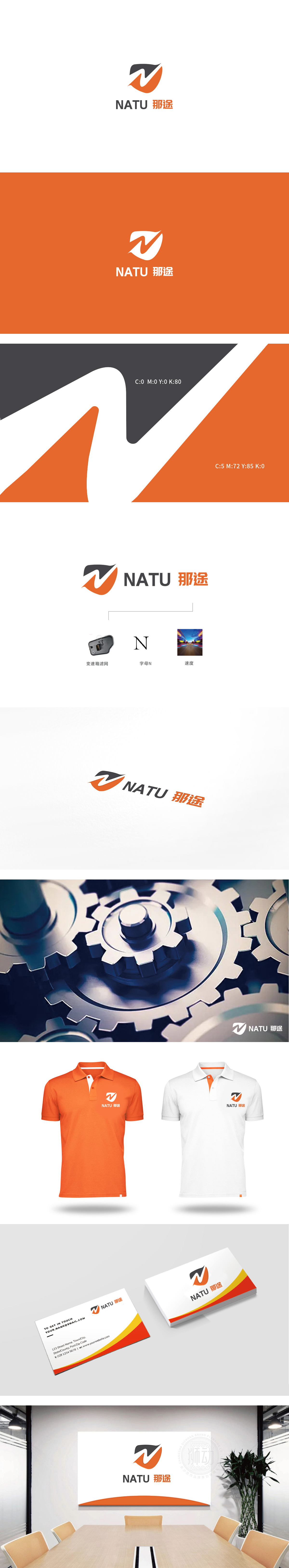
狮动设计采用抽象化的“N”字母与流线型动态轮廓构成,黑色三角形与橙色弧形形成对比,黑色象征专业、技术可靠,橙色则传递活力与速度感;“V”形线条既是字母“N”的抽象化延伸,又像一道加速的光轨,强化“前行、突破”的动态联想。整体通过抽象符号的具象化解读(N字母→动态图形)、色彩的情感化分层(技术黑×活力橙)、元素的价值链串联(产品→符号→场景),成功构建了“专业可靠且充满动力”的品牌形象。
Lion design is composed of abstract "N" letters and streamlined dynamic contours. The black triangle is in contrast with the orange arc. Black symbolizes professionalism and reliable technology, while orange conveys vitality and speed. The "V" line is not only an abstract extension of the letter "N", but also an accelerated light track, which strengthens the dynamic association of "moving forward and breaking through". As a whole, through the concrete interpretation of abstract symbols (N letters → dynamic graphics), emotional layering of colors .


扫码或拨打添加客服微信


