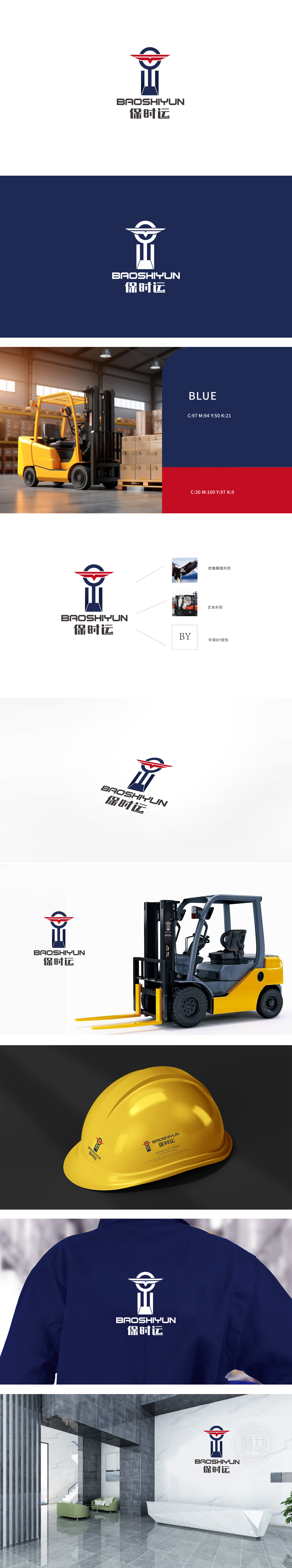
狮动设计以红色展翅形态为视觉焦点,轮廓线条锐利且富有张力,既模拟了“老鹰展翅”的翱翔姿态(象征高远志向与领导力),又通过对称结构暗合“叉车货叉”的机械属性——红色作为高饱和色彩,强化视觉冲击力,传递活力与专业感。“BY”字母的隐藏式设计,红色翅膀的折线与蓝色立柱的交叉处,通过线条走向自然构成“B”和“Y”的抽象形态,实现“图形即字母”的双重表意,整体图形呈“金字塔”式向上收拢,红色翅膀朝上延伸,传递品牌“向上发展”的进取精神。
Lion design focuses on the form of red spreading wings, and its outline lines are sharp and full of tension, which not only simulates the soaring posture of "eagle spreading wings" (symbolizing high ambition and leadership), but also coincides with the mechanical property of forklift fork through symmetrical structure-red is used as a high saturation color, which strengthens visual impact and conveys vitality and professionalism. The hidden design of the letter "BY", the intersection of the broken line of the red wing and the blue column.


扫码或拨打添加客服微信


