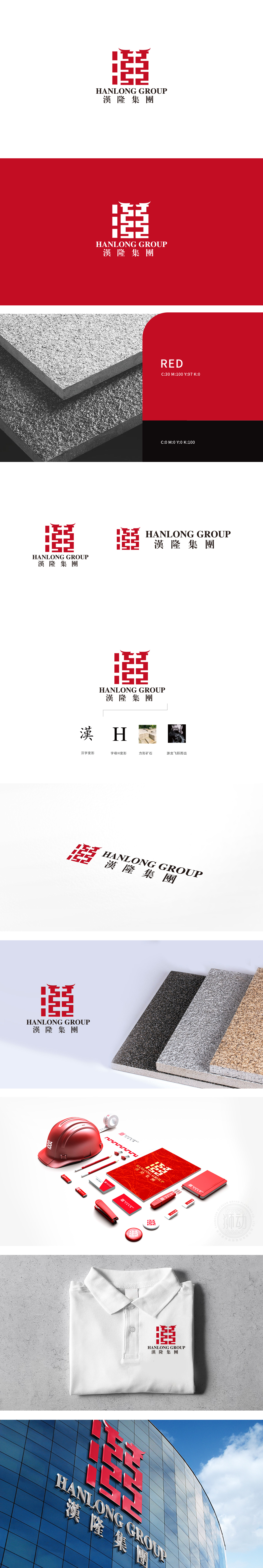
狮动设计以红色方形印章为基底,内部通过几何线条的穿插组合,形成兼具多重意象的视觉符号:汉字“漢”的解构与重构: 线条巧妙融合了“漢”字的笔画骨架,赋予其现代建筑般的硬朗质感。字母“H”的隐藏嵌套,实现了中文字符与拉丁字母的视觉融合,体现品牌国际化与本土化的平衡。印章与“回纹”的基因传承: 暗喻“生生不息”的品牌愿景,整体以“漢”为文化锚点,以“隆”为发展目标,通过几何美学、色彩心理学与意象叙事的结合,传递了“植根中华、稳健厚重”的品牌基因。
Lion design is based on the red square seal, and the geometric lines are interspersed and combined to form a visual symbol with multiple images: the deconstruction and reconstruction of the Chinese character "Han"; the lines skillfully blend the stroke skeleton of the word "Han", giving it a tough texture like modern architecture. The hidden nesting of the letter "H" realizes the visual integration of Chinese characters and Latin letters, and reflects the balance between brand internationalization and localization. The genetic inheritance of seal and palindrome is a metaphor for the brand vision of "endless life".


扫码或拨打添加客服微信


