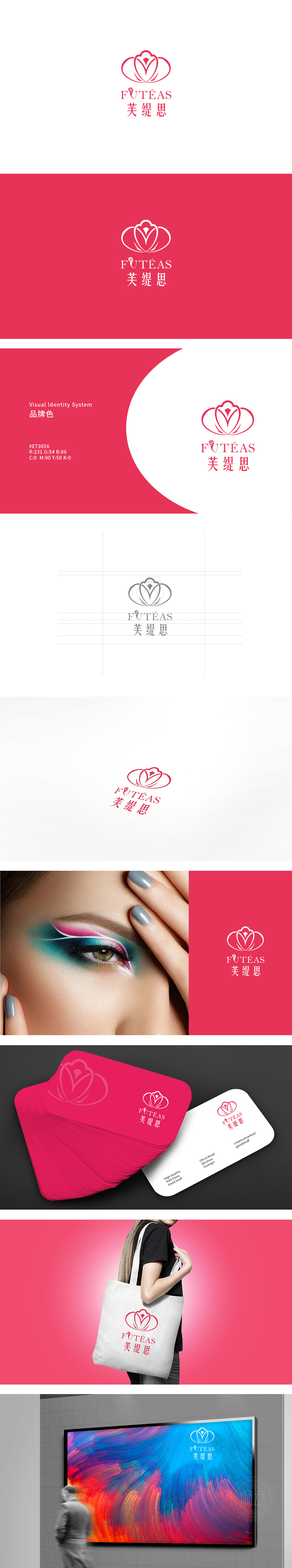
狮动设计以「花」为核心,传递美容行业的「自然感」与「女性化」,线条采用柔和的曲线,花瓣层次分明且呈对称分布,既保留了自然花卉的柔美意象(符合日化美容产品常关联的“植物成分”“自然护肤”等认知),花瓣中心的菱形图案是点睛之笔——既象征产品品质的“精致感”“高端感”,又通过细微的棱角打破纯曲线的柔腻,形成“柔中带刚”的视觉平衡,暗合现代女性对“柔美”与“力量感”的双重追求。整体采用粉色系,是日化美容行业的经典配色,直接关联“温柔”“优雅”“女性化”等情感联想,传递出细腻的品牌气质,整体的精致感,传递“适合女性”“关注美丽与自我呵护”的品牌定位。
Lion design takes "flowers" as the core, and conveys the natural feeling and femininity of the beauty industry. The lines adopt soft curves, and the petals are well-defined and symmetrically distributed, which not only retains the feminine image of natural flowers (in line with the cognition of "plant composition" and "natural skin care" commonly associated with daily beauty products), but also the diamond pattern in the center of the petals is the finishing touch, which not only symbolizes the exquisite feeling of product quality. The overall color is pink, which is a classic color matching in the daily cosmetic industry.


扫码或拨打添加客服微信


