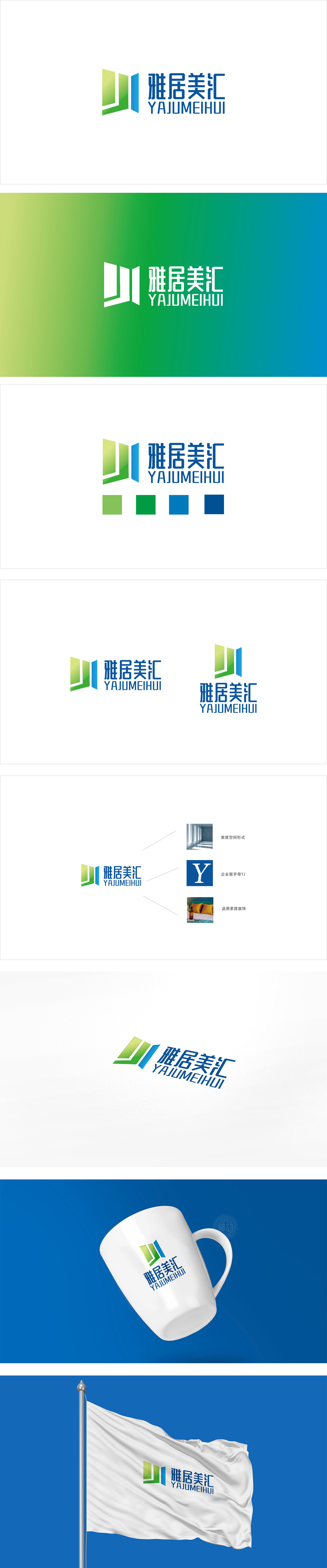
狮动设计采用几何化的“窗框+窗扇”组合,通过简洁的线条与立体层次感,完美还原了门窗的本质特征:整体造型呈“打开”的趋势(:隐含“通风、通透”的门窗核心价值,同时传递“开放、欢迎”的品牌态度。绿色+蓝色的组合精准匹配了门窗行业的,绿色:象征“环保、自然、健康”,同时传递“雅居”(舒适居住)的品牌内涵;蓝色:代表“专业、可靠、科技”,暗示品牌在门窗制造中的技术实力,增强用户对产品质量的信任。整体将“门窗的功能、品牌的定位、用户的需求”完美融合,堪称“行业属性与设计美感兼顾”的典范。
Lion Design adopts the geometric combination of "window frame+window sash", which perfectly restores the essential characteristics of doors and windows through simple lines and three-dimensional layering: the overall shape is "open" (implying the core value of doors and windows "ventilation and transparency" and conveying the brand attitude of "openness and welcome". The combination of green and blue accurately matches the door and window industry. Green symbolizes "environmental protection, nature and health" and conveys the brand connotation of "elegant residence" (comfortable living).


扫码或拨打添加客服微信


