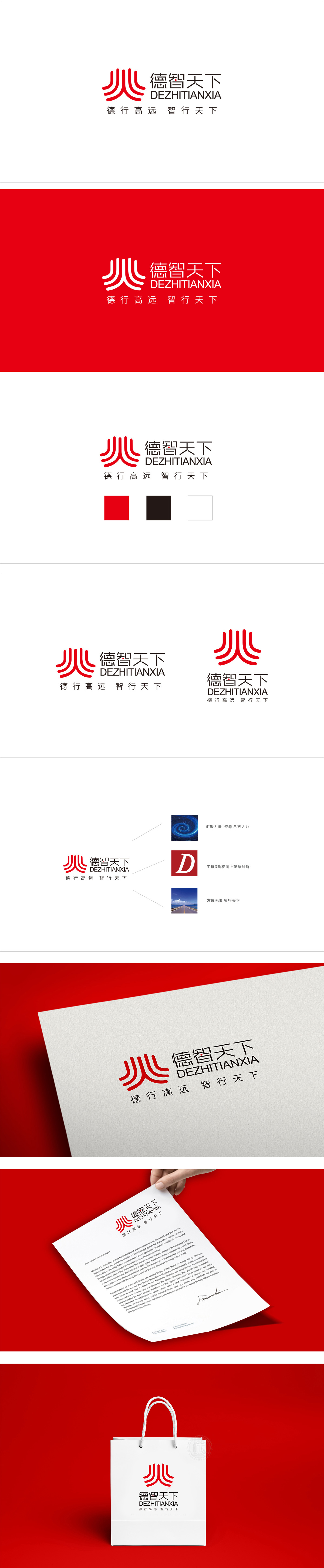
狮动设计采用抽象化的“符号隐喻”,将“德”“智”“人”三大关键词浓缩为一个可感知的视觉符号:整体类似“人”字的抽象变形(呼应“德行天下”的人本内核),也像燃烧的火焰(传递“智”的活力与激情),更隐含“德”字的偏旁结构。这种“一形多义”的设计,让图形既有明确的品牌关联(德、智、人),又保留了足够的想象空间,符合“天下”的包容性。红色作为主色,既传承了传统文化中的吉祥、大气(符合“天下”的格局),又通过鲜艳的色调传递了品牌的活力与进取性(呼应“智行天下”的行动力)。整体传递“德行践行、智慧前行”的品牌主张。
Lion Design adopts abstract symbolic metaphor, which condenses the three key words of "virtue", "wisdom" and "human" into a perceptible visual symbol: the whole is similar to the abstract deformation of the word "human" (echoing the humanistic core of "virtue in the world"), and it is also like a burning flame (conveying the vitality and passion of "wisdom"), which implies the radical structure of the word "virtue". This "ambiguous" design not only makes the graphics have a clear brand association (morality, intelligence and people), but also retains enough imagination space, which is in line with the inclusiveness of "the world". As the main color, red not only inherits the auspiciousness and atmosphere in traditional culture.


扫码或拨打添加客服微信


