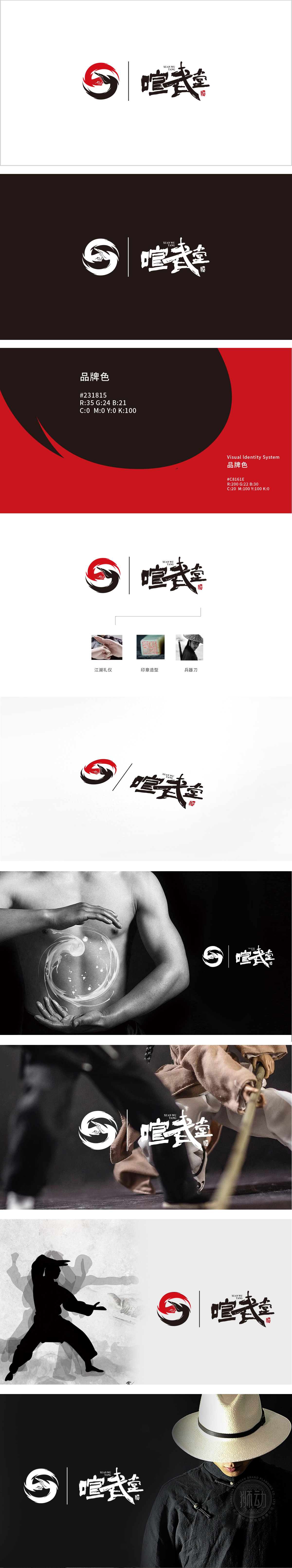
狮动设计以红黑两色构成闭环,太极哲学的现代转译:红黑分割的环形既是太极阴阳相生的抽象化,又通过笔触的“断裂”与“旋转”打破静态平衡——红色如火焰般上扬,黑色似旋风般下沉,形成“动势闭环”,暗合武术中“刚柔相济、攻防一体”的核心思想。力量传导的视觉动线:黑色笔触从底部顺时针缠绕,如武术中的“缠丝劲”或“螺旋力”,红色部分则以锐角突破环形边界,形成“内收外展”的动态平衡,恰似一拳击出时“蓄力-爆发”的能量轨迹,让静态图形产生了“未发先至”的速度感。Logo的旋转动势形成“器-技-意”的三重关联——刀为“器”,Logo为“技”,整体设计为“意”(武学精神),层层递进构建完整的武术认知体系。
Lion designed to form a closed loop with red and black colors. The modern translation of Taiji philosophy: The ring divided by red and black is not only the abstraction of Tai Chi's yin and yang, but also breaks the static balance through the "fracture" and "rotation" of strokes-red rises like a flame, and black sinks like a whirlwind, forming a "dynamic closed loop", which coincides with the core idea of "combining rigidity with softness, and integrating attack and defense" in Wushu. Visual dynamic line of power transmission: black brush strokes are wound clockwise from the bottom, such as "silk-winding strength" or "spiral force" in martial arts, and the red part breaks through the circular boundary at an acute angle, forming a dynamic balance of "adduction and abduction", just like the energy trajectory of "accumulation-explosion" when a punch is punched.


扫码或拨打添加客服微信


