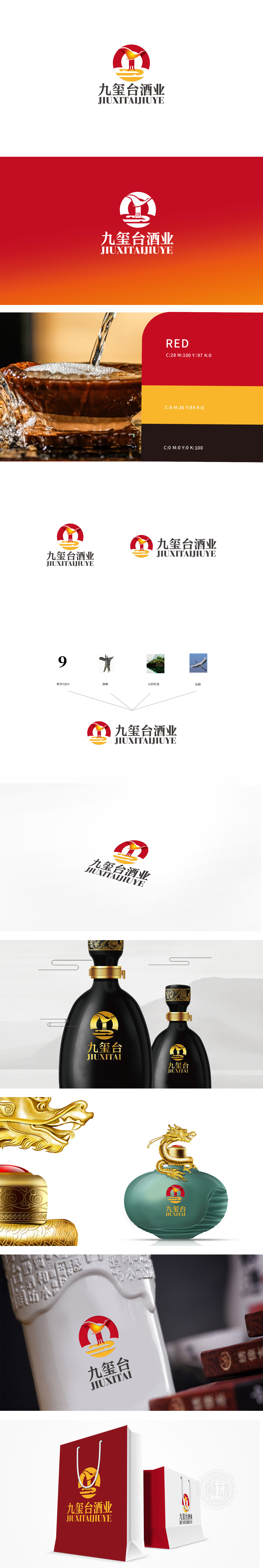
九玺台酒业委托狮动打造品牌视觉符号时,狮动从“文化传承+行业特质”双向破局:红金主色调锚定酒业厚重感与高端属性;环形轮廓象征行业积淀与品牌向心力,凤凰化酒樽的创意既呼应酿酒文化根脉,又以灵动姿态传递品牌焕新活力;下方流线型设计暗喻酒液流动,更藏“品质如金”的坚守;中英文字体兼顾稳重与现代感,强化记忆点。该LOGO上线后,助力九玺台快速建立“文化底蕴+品质驱动”的市场认知,也让新客户直观感知其从策略到落地的全维服务力。
When Jiuxitai Liquor Industry entrusted Lion Motion to create a brand visual symbol, Lion Motion broke through the "cultural heritage+industry characteristics" in both directions: the main color of red and gold anchored wine.Heavy sense of industry and high-end attributes; The circular outline symbolizes industry accumulation and brand centripetal force, and the creativity of Phoenix wine bottle not only echoes the root vein of brewing culture, but also Deliver brand rejuvenation vitality with a smart attitude; The streamlined design below is a metaphor for the flow of wine, and it also hides the persistence of "quality as gold".


扫码或拨打添加客服微信


