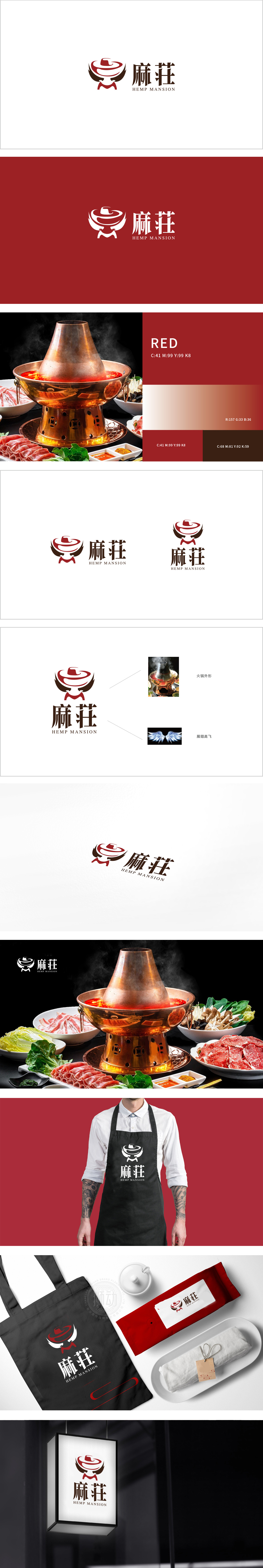
狮动设计以简约的线条,描绘出火锅外形,行业辨识度高,顶部螺旋纹路设计,暗含“旋转”“热气升腾”的动态感,巧妙中式餐饮的热食场景,同时红色作为中式文化中的吉祥色,强化品牌记忆点。。该标志通过图形符号对风味、场景双定位,实现了视觉辨识度(图腾化图形)+品类精准度(“麻”字直击口味)+文化溢价(中式元素现代转化) 的,,展现了品牌在“传统传承"与“现代创新"之间的平衡能力。
Lion design depicts the shape of hot pot with simple lines, which is highly recognized by the industry. The spiral pattern design at the top implies the dynamic sense of "rotation" and "hot air rising", and the hot food scene of Chinese catering is clever. At the same time, red is used as an auspicious color in Chinese culture to strengthen brand memory. Through the dual positioning of flavor and scene by graphic symbols, the logo has achieved visual recognition.


扫码或拨打添加客服微信


