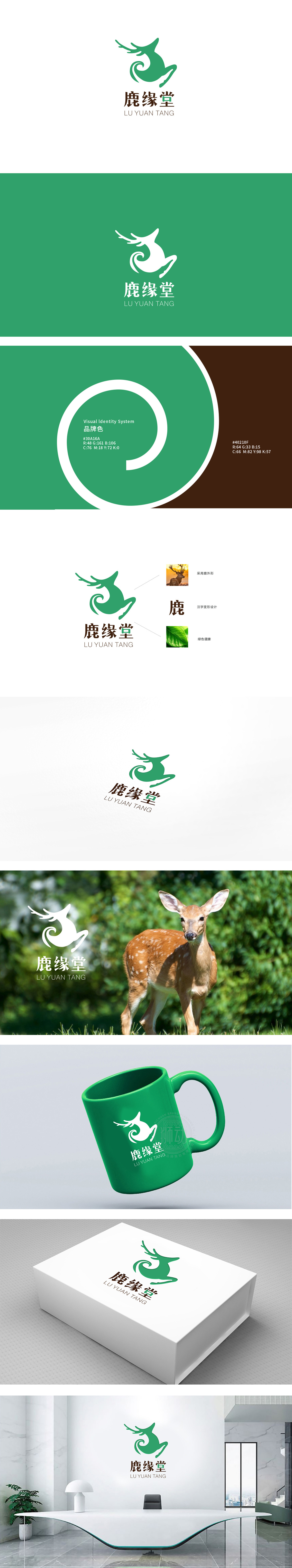
狮动设计采用抽象化的鹿形设计,既保留了鹿的生物特征,又通过简化线条增强了现代感。鹿在传统文化中是“祥瑞、长寿、滋补”的象征,直接关联保健品的“养生、天然萃取”属性,鹿身曲线与尾部漩涡状设计,既模拟了鹿奔跑的动态感,又暗合“循环、生生不息”的健康理念,绿色主导,传递“安全、健康、纯净”的产品承诺,整体通过核心符号(鹿)的文化隐喻、色彩(绿色)的天然联想、文字(堂)的信任背书,构建了一套完整的“视觉-认知-价值”传递体系,既保留了保健品需要的“权威感”,又通过灵动的视觉语言吸引更广泛年龄层。
Lion design adopts abstract deer-shaped design, which not only retains the biological characteristics of deer, but also enhances the modernity by simplifying lines. Deer is a symbol of auspiciousness, longevity and nourishment in traditional culture, which is directly related to the nature of health care products. The design of deer body curve and tail vortex not only simulates the dynamic feeling of deer running, but also coincides with the health concept of "circulation and endless life", and is green-oriented, conveying the product promise of "safety, health and purity". A complete set of "vision-cognition-value" transmission system is constructed.


扫码或拨打添加客服微信


