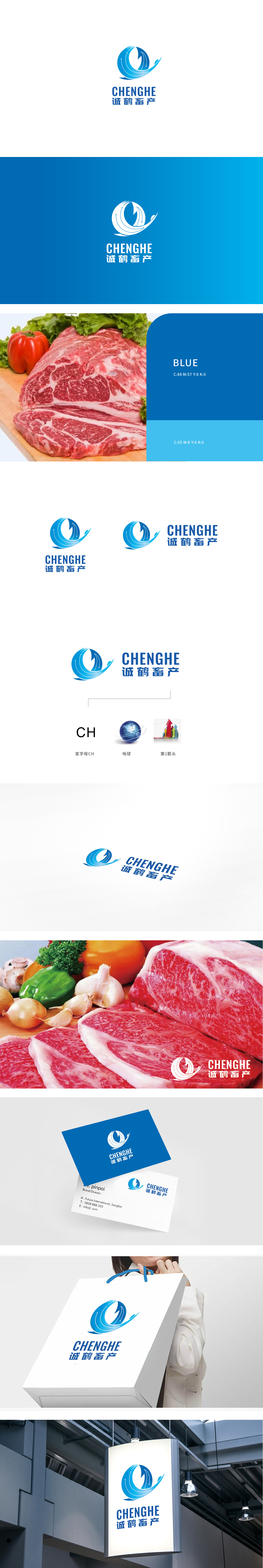
狮动设计以蓝色环形线条如水流、气流般循环流动,内嵌向上的箭头,既象征畜牧产业中“养殖-加工-销售”的闭环生态,也暗示“可持续发展”与“高效循环”的现代农业理念。地球图形:代表品牌的全球化视野或对“安全、无污染”的承诺。主标志的“循环闭环”+地球的“全球化/生态化”+箭头的“增长性”,三者共同构建了品牌故事:以诚信为核心,通过现代化畜牧管理(循环生态),实现可持续增长与市场拓展,完整覆盖了农业品牌从“生产端”到“市场端”的价值传递。
Lion design uses blue circular lines to circulate like water and air, with upward arrows embedded, which not only symbolizes the closed-loop ecology of "breeding-processing-selling" in animal husbandry industry, but also implies the modern agricultural concept of "sustainable development" and "efficient circulation". Earth graphic: represents the brand's global vision or commitment to "safety and pollution-free". The "circular closed loop" of the main logo+the "globalization/ecologicalization" of the earth+the "growth" of the arrow together construct the brand story: take honesty as the core.


扫码或拨打添加客服微信


