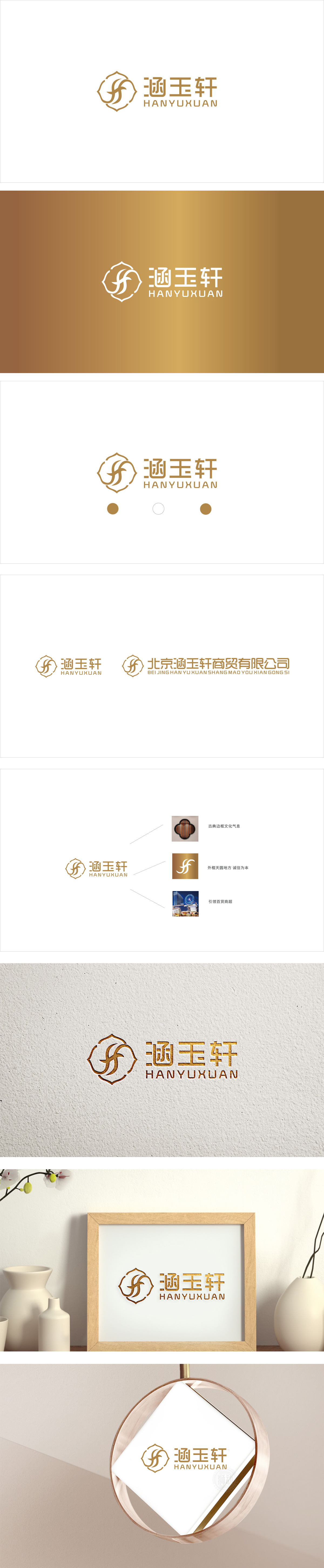
狮动设计以对称式传统纹样为基底,外框的花瓣状线条传递出古典、雅致的东方美学。交织的曲线(似「H」「Y」的融合),既呼应了品牌名称中的「涵」(包容、滋养)与「玉」(温润、珍贵),更以流动的形态传递出美容产品的滋养感。这种「具象名称+抽象意象」的转化,既强化了品牌记忆点,又自然关联了「养颜、润养」的行业功能。金色传递高端美容的品质感。整体通过简化笔画实现了现代感,符合「涵玉轩」「东方养颜」品牌故事,又适应了当代消费者对「简约审美」的需求。
Lion design is based on symmetrical traditional patterns, and the petal-shaped lines of the outer frame convey classical and elegant oriental aesthetics. The interwoven curve (like the fusion of "H" and "Y") not only echoes the "Han" (inclusive and nourishing) and "Jade" (moist and precious) in the brand name, but also conveys the nourishing feeling of beauty products in a flowing form. This transformation of "concrete name+abstract image" not only strengthens the brand memory point, but also naturally relates to the industry function of "nourishing and nourishing". Gold conveys the sense of quality of high-end beauty.


扫码或拨打添加客服微信


