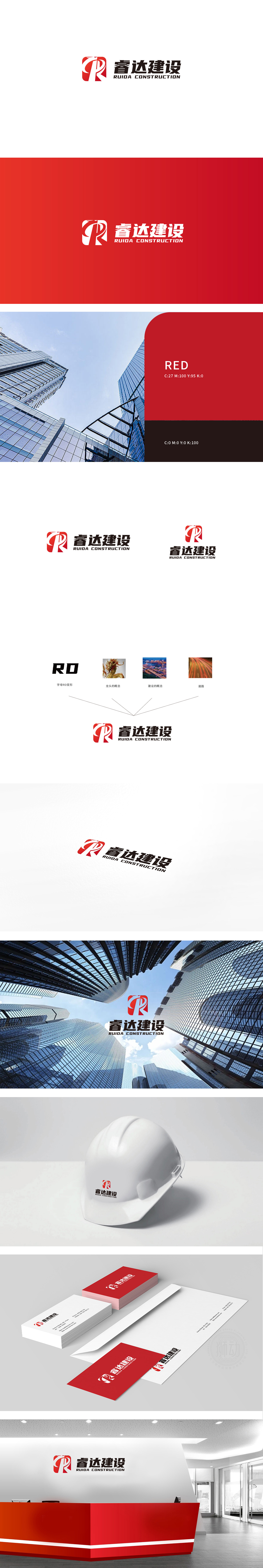
狮动设计以品牌首字母“R”为基础,通过几何化线条与动态笔触结合,形成兼具“建筑结构”与“向上趋势”的视觉符号。“R”的竖线结构,类似建筑中的“承重墙”意象,传递“建设行业”的稳固与专业;整体色彩组合既彰显活力,又不失行业所需的“稳重、权威”气质。整体通过 “字母变形图形化 + 经典色彩搭配 +结构化排版” 的组合,成功实现了 “行业属性可视化”与 “品牌个性差异化”,传递了 “专业、可靠、进取” 的品牌气质。
Lion Based on the brand initials "R", Lion Motion Design combines geometric lines with dynamic strokes to form a visual symbol with both "architectural structure" and "upward trend". The vertical structure of "R" is similar to the image of "load-bearing wall" in architecture, conveying the stability and professionalism of "construction industry"; The overall TINT not only shows its vitality, but also loses the "stable and authoritative" temperament required by the industry. entiretyThrough the combination of "letter deformation and graphics+classic color matching+structured typesetting", the "industry attribute visualization" and "brand personality differentiation" were successfully realized.


扫码或拨打添加客服微信


