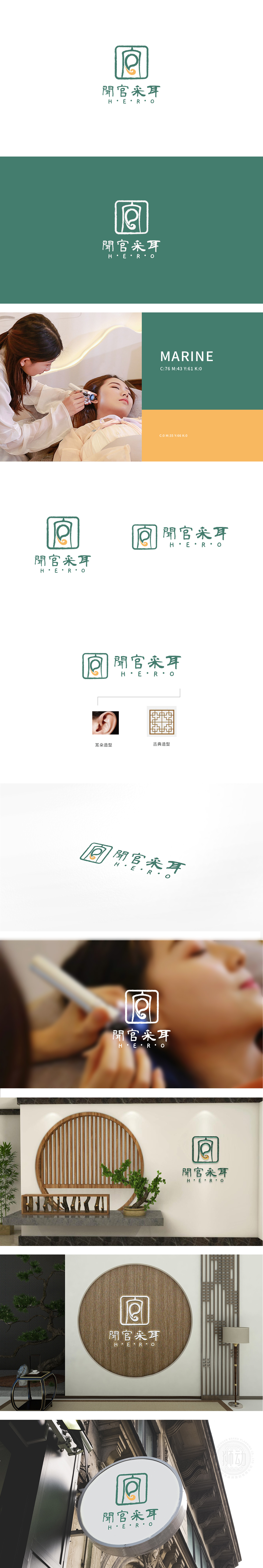
狮动设计“以“耳朵”为核心识别符号,轮廓采用流畅的曲线勾勒出耳朵的外轮廓,内部巧妙融入采耳工具的抽象形态(如橙色螺旋线条,似传统采耳勺的动态延伸),既直观传递“采耳”的服务属性,又通过线条的虚实变化避免了直白的工具展示,增添了画面的韵律感。又通过墨色晕染般的边缘处理,柔化了几何线条的生硬,传递出“耳道”的包裹感与私密感——这种“内圆外方”的结构,暗合中式哲学中“天圆地方”的隐喻,也象征着“采耳”服务对“内在舒适”的专注。整体如同中国水墨画中“无画处皆成妙境”,让“采耳”这一具象服务,延伸出“静心、疗愈”的精神体验,契合现代消费者对“中式养生”的情感需求。
Lion design takes "ear" as the core identification symbol, and the outline uses smooth curves to outline the outer outline of the ear, and the interior is skillfully integrated into the abstract form of ear-picking tools (such as orange spiral lines, which are like the dynamic extension of traditional ear-picking spoons), which not only intuitively conveys the service attribute of "ear-picking", but also avoids the straightforward tool display through the virtual and real changes of lines, adding a sense of rhythm to the picture. Through the ink-like edge treatment, the stiffness of geometric lines is softened, and the sense of wrapping and privacy of the ear canal is conveyed-this structure of "inner circle and outer side" coincides .


扫码或拨打添加客服微信


