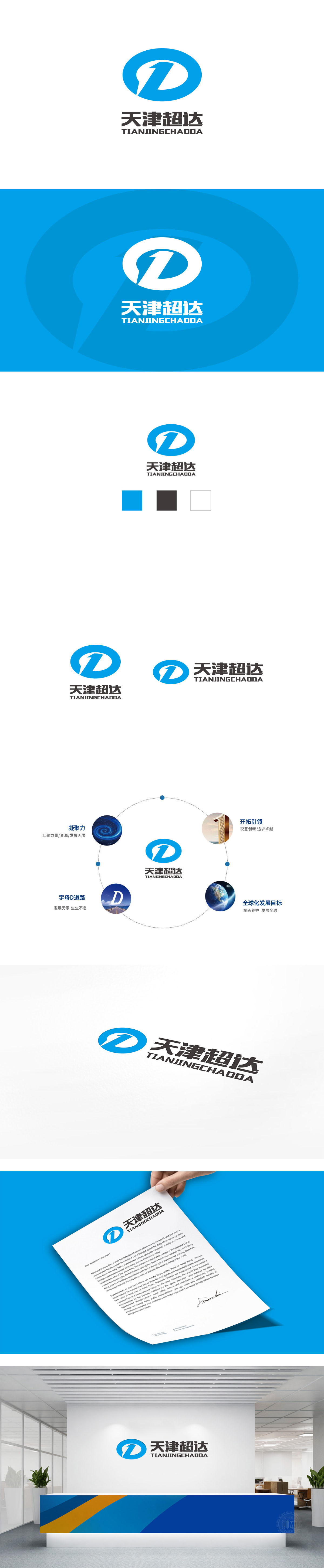
狮动设计采用「圆环+内藏的“1”+向前的箭头」组合:“1”:直接传递“领先、首选”的含义,也暗示品牌追求“行业头部”的市场定位,符合消费者对“优质车源/服务”的期待;圆环:包裹住核心图形,圆环象征“循环往复的服务”,符合消费者对“长期信任”的需求,强化“服务价值”的感知。整体布局对称:符合中国人“稳重大方”的审美,传递品牌”靠谱、专业“ 的品牌形象。
Lion design adopts the combination of "circle+hidden" 1 "+forward arrow": "1" directly conveys the meaning of "leading and first choice", and also implies that the brand pursues the market positioning of "industry head", which is in line with consumers' expectations for "quality vehicle source/service"; Ring: Wrapping the core graphics, the ring symbolizes "cyclic service", which meets the consumer's demand for "long-term trust" and strengthens the perception of "service value". Symmetrical overall layout.


扫码或拨打添加客服微信


