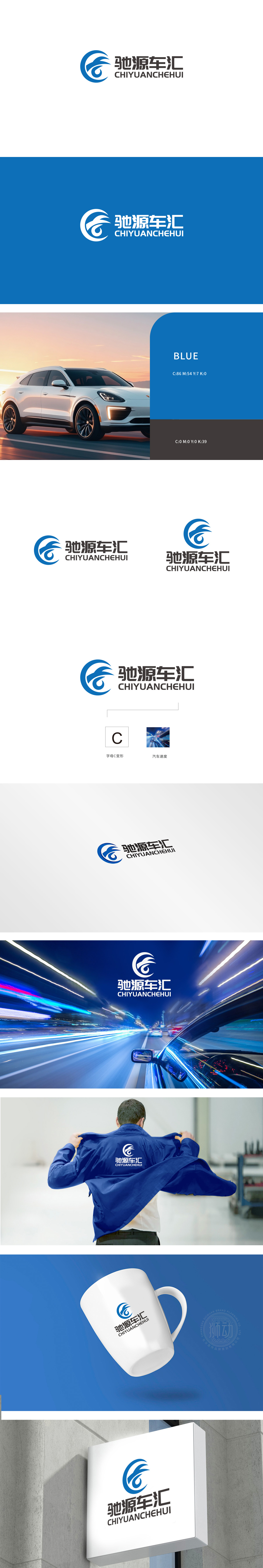
狮动设计以首字母“C”为基础,通过流畅的曲线变形,既保留了字母的识别性,又赋予其强烈的动态感。闭环圆形与延伸的飞翼/飘带造型结合,形成“旋转上升”的视觉张力,象征速度与前进感。图形中暗藏汽车行业的核心意象——上扬的线条类似“车翼”或“车灯划破空气的轨迹”,整体传递出“驾驭”“驰骋”的品牌联想,与“驰源车汇”的“车”属性高度契合。采用纯净的深蓝色作为主色调,蓝色在行业中常与“专业”“可靠”“科技感”相关联,符合汽车服务/销售平台对“值得信赖”的品牌调性需求。
Lion design is based on the initial letter "C", and through smooth curve deformation, it not only retains the recognition of letters, but also gives them a strong sense of dynamic. The closed-loop circle is combined with the extended flying wing/ribbon shape to form the visual tension of "rotating and rising", which symbolizes the sense of speed and progress. The graphic hides the core image of the automobile industry-the rising line is similar to the "wing" or "the trajectory of the car light piercing the air", which conveys the brand association of "driving" and "galloping" as a whole.


扫码或拨打添加客服微信


