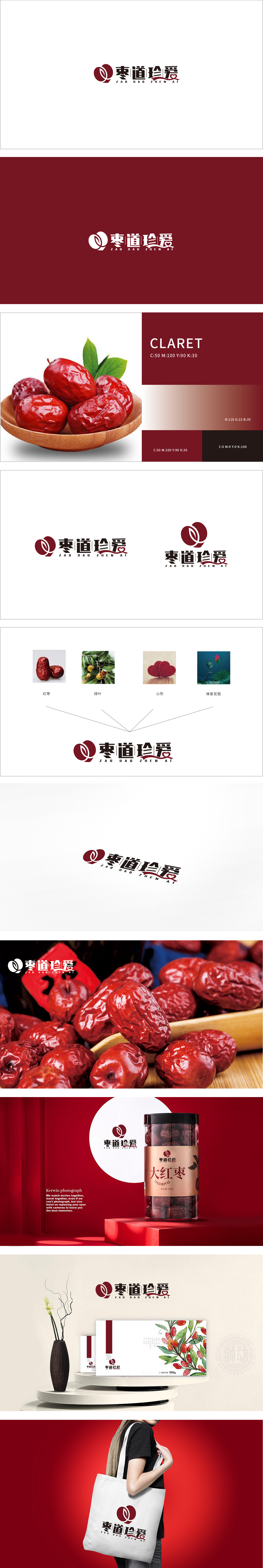
狮动设计将“枣”字具象化呈现,红枣图形直接点明产品核心成分,传递“天然食材”“传统养生”的基础认知,符合保健品对“原料真实性”的信任需求。其饱满的形态和暖红色调,也暗合“滋补”“温润”的产品功能联想。绿叶元素的加入强化了“原生态”品牌主张,与红枣形成“食材+自然”的组合,凸显“食疗养生”的轻健康属性,贴合现代消费者对“天然健康”的偏好。心形符号,赋予产品“关爱”“珍视”的情感价值.花苞的“禅意”设计增添了东方美学韵味,传递“从容养生”“自然之道”的品牌理念。整体“以红枣为核心,传递自然养生与珍爱理念”的定位。
Lion design presents the word "jujube" figuratively, and the jujube graphic directly points out the core components of the product, conveying the basic cognition of "natural ingredients" and "traditional health preservation", which meets the trust demand of health care products for "authenticity of raw materials". Its full shape and warm red tone also coincide with the product function association of "nourishing" and "moistening". The addition of green leaves strengthens the brand proposition of "original ecology" and forms a combination of "ingredients and nature" with jujube, which highlights the light health attribute of "dietotherapy and health preservation" and fits the preference of modern consumers for "natural health". The heart-shaped symbol endows the product with the emotional value of "caring" and "cherishing".


扫码或拨打添加客服微信


