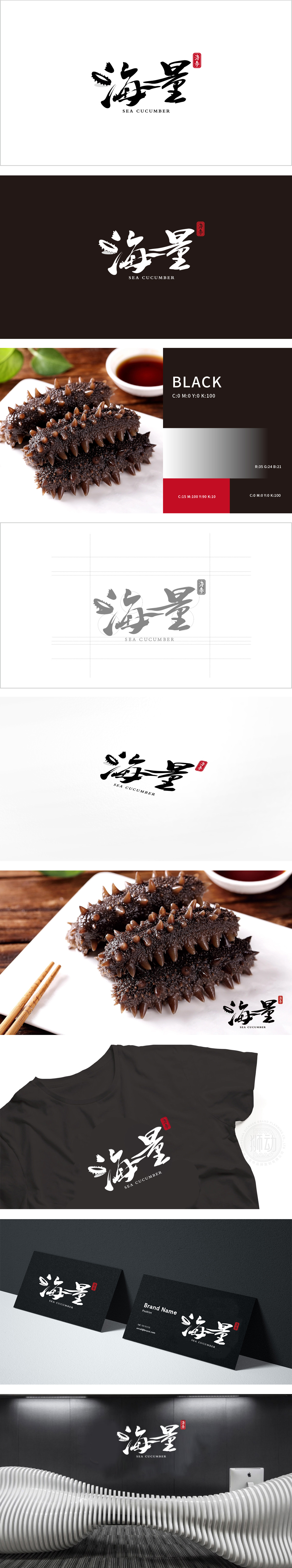
狮动设计将海”字的(三点水)被解构为海参的抽象形态,带有自然生物的肌理感;笔触以流畅的曲线延伸,模拟海参身体的柔韧形态,末端的飞白效果既保留了书法的灵动,又暗合海参体表的褶皱质感;“量”字以稳重的书法结构平衡整体画面,笔画的粗细对比与“海”字的灵动形成动静互补,暗示品牌对海参品质与产量的双重追求,强化“海量”的品牌名内涵。整体采用毛笔书法字体,传递出中国传统滋补文化的厚重感,符合海参作为高端养生食材的品类属性。
Lion design deconstructs the word "sea" (three points of water) into the abstract form of sea cucumber, which has the texture of natural creatures; The strokes extend in a smooth curve, simulating the flexible shape of the sea cucumber body, and the flying white effect at the end not only retains the agility of calligraphy, but also coincides with the wrinkle texture of the sea cucumber body surface; The word "quantity" balances the whole picture with a steady calligraphy structure, and the contrast between the thickness of strokes and the agility of the word "sea" form a dynamic and static complement.


扫码或拨打添加客服微信


