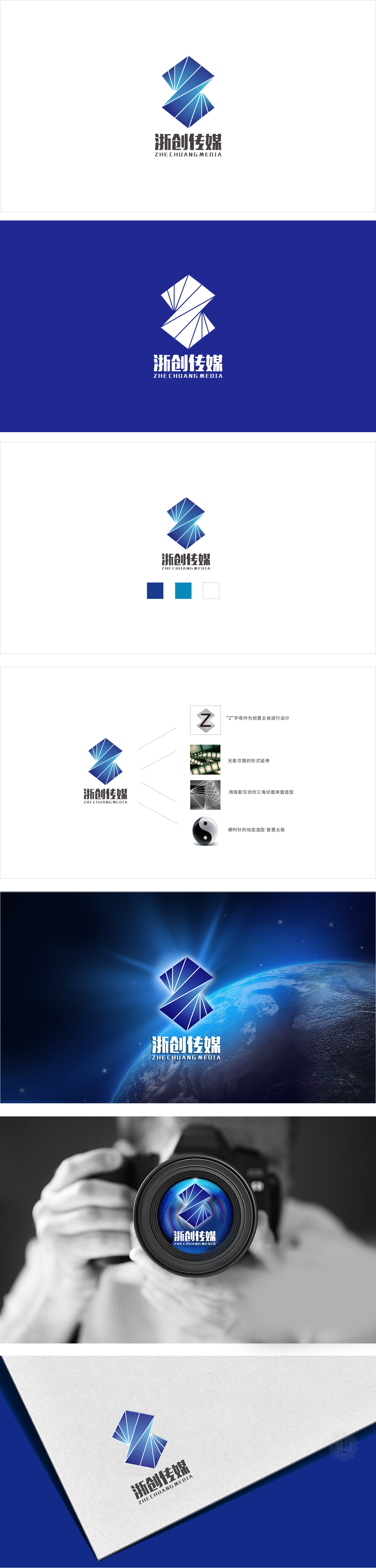
狮动设计将首字母“Z”的几何变形**——通过蓝白渐变的分割块+放射状线条,变成了“正在展开的翅膀”。这种设计既保留了强辨识度(一眼能联想到“浙创”),又用棱角与线条的延伸感传递出动感、前沿、创新的气质——刚好对应传媒行业“传递信息、拥抱变化”的核心需求。用蓝白调定调专业与活力,从浅蓝到深蓝的渐变,既体现了传媒公司需要的“专业可靠”,又通过渐变增加了科技感与层次感,符合当下传媒行业数字化、年轻化的趋势;让人快速get“这是一家年轻、专业、有创新力的传媒公司”。
The geometric deformation of the initial letter "Z" of Lion Motion Design * *-through the blue-and-white gradual division block+radial lines, it becomes "unfolding wings". This design not only retains a strong recognition (it can be associated with "Zhechuang" at a glance), but also conveys a dynamic, cutting-edge and innovative temperament with the extension of corners and lines-just corresponding to the core needs of the media industry to "convey information and embrace change".Using blue and white tones to set the tone of professionalism and vitality.


扫码或拨打添加客服微信


