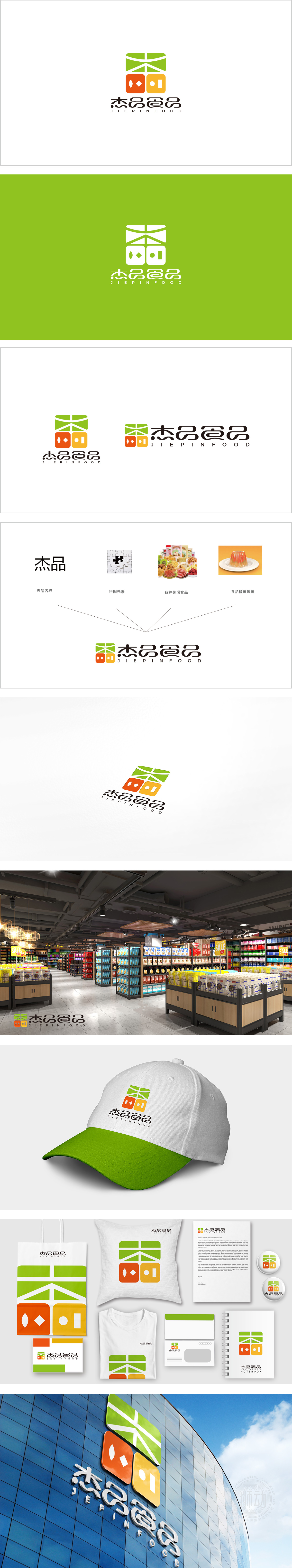
狮动设计以田字格结构,隐喻“耕耘与收获”,“田”字直接关联农业、土地,暗示食品的“源头属性”;方正结构则传递出“规范、可靠、品质保障”的品牌形象,符合食品行业对安全、信任的核心诉求。水滴形+菱形——水滴可能代表“新鲜、水分”,菱形似“谷物颗粒”,传递食材的天然属性;整体以“方正规整”为骨架,通过自然色彩、抽象图形的组合,将“食材源头、加工过程、健康属性、标准化品质”等食品行业核心要素浓缩其中,既符合消费者对食品品牌的心理预期(天然、可靠、有食欲),又通过细节设计体现了品牌“用心做品质”的理念。
Lion design uses Tian Zige structure, which means "cultivation and harvest", and the word "field" is directly related to agriculture and land, implying the "source attribute" of food; Founder structure conveys the brand image of "standardization, reliability and quality assurance", which is in line with the core demands of food industry for safety and trust. Water drop shape+diamond-water drop may represent "freshness and moisture", and the diamond shape is like "grain particles", which conveys the natural attributes of ingredients; The overall framework is "square and regular", and through the combination of natural colors and abstract graphics.


扫码或拨打添加客服微信


