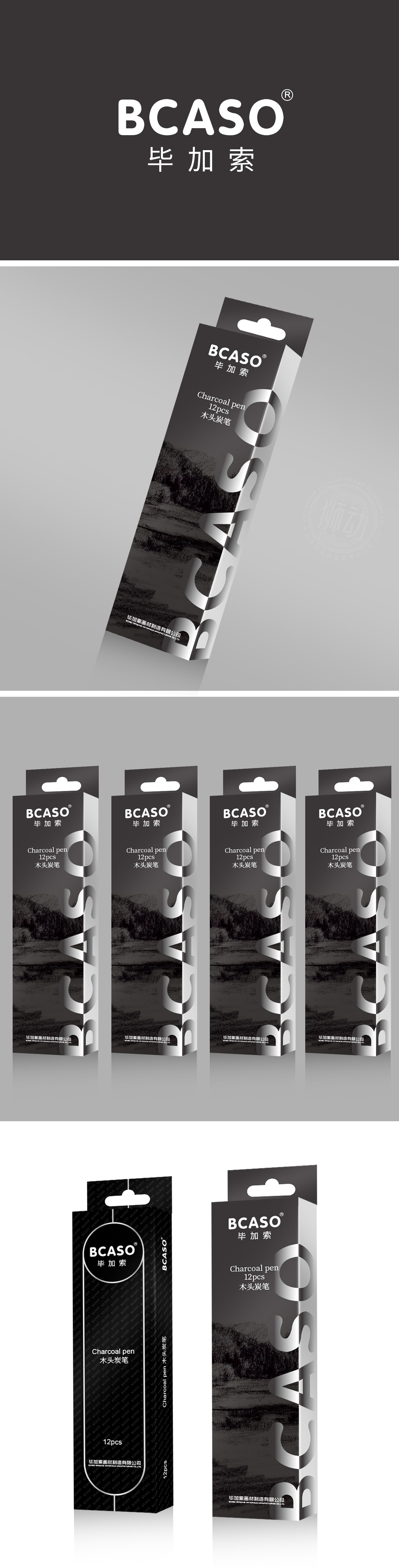
狮动设计以圆形纯白底色突出“BCASO”黑色粗体LOGO,搭配下方“毕加索”中文名称,形成强烈视觉焦点,符合快消品“第一眼识别”原则。倾斜切割的字体增强动感,既平衡了黑色主调的沉稳,又通过留白与阴影营造出立体层次,强化品牌记忆点。全黑主色调传递“木炭笔”的产品属性,搭配银色字体与图案,形成冷静、专业的视觉联想,符合美术用品的“工具感”与“质感诉求”,通过“极简美学+功能优先”的设计逻辑,精准定位“专业美术工具”的产品属性。
Lion design highlights the bold black LOGO of "BCASO" with a round pure white background, and forms a strong visual focus with the Chinese name of "Picasso" below, which conforms to the principle of "first sight recognition" of FMCG. Tilt-cut fonts enhance the sense of movement, which not only balances the calmness of the black theme, but also creates a three-dimensional level through blank space and shadow, and strengthens the brand memory. All-black main color conveys the product attributes of charcoal pen, and with silver fonts and patterns, it forms a calm and professional visual association.


扫码或拨打添加客服微信


