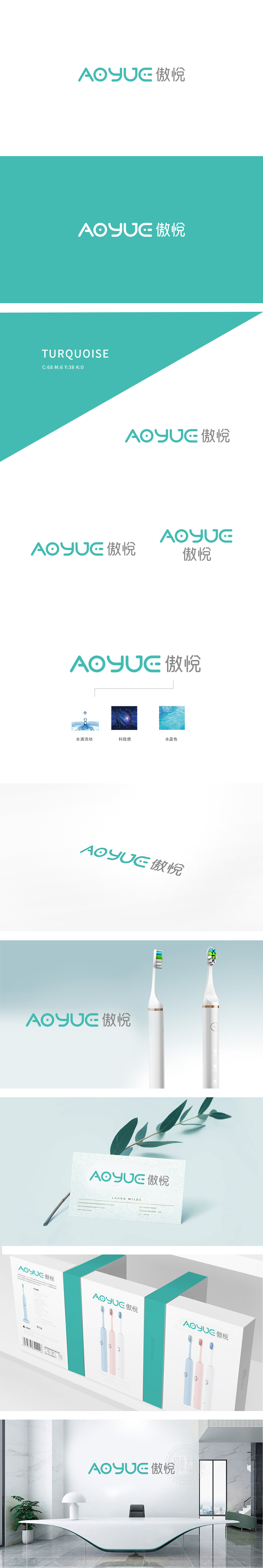
狮动设计流畅曲线为主导:字母“A”“O”“Y”“U”“E”均采用圆润、连续的线条,这种设计既符合电动牙刷握持时“舒适、贴合”的使用体验,也传递出品牌温和、友好的调性,适合口腔护理产品强调的“安全、柔和”属性。“O”的细节巧思:字母“O”内部加入一个小点,既像声波电动牙刷的核心——震动电机的具象化符号,也可联想为“精准清洁”的聚焦感,让抽象图形与产品功能产生隐性关联。主色调:低饱和青绿色:青绿色常与“洁净、自然、健康”相关联,整体通过线条的流动性和色彩的柔和感,中和了“科技产品”的冰冷属性,让“傲悦”这一品牌名中的“傲”(暗示技术自信)与“悦”(强调使用体验愉悦)形成了视觉与理念的统一。
Lion design is dominant: the letters "A", "O", "Y", "U" and "E" all adopt rounded and continuous lines, which not only conforms to the comfortable and snug use experience of the electric toothbrush, but also conveys the gentle and friendly tonality of the brand, and is suitable for the "safety and softness" attributes emphasized by oral care products. The details of "O" are ingenious: a dot is added inside the letter "O", which is not only like the figurative symbol of the vibration motor, the core of the acoustic electric toothbrush, but also can be associated with the focus of "precise cleaning", which makes the abstract graphics and product functions implicitly related.


扫码或拨打添加客服微信


