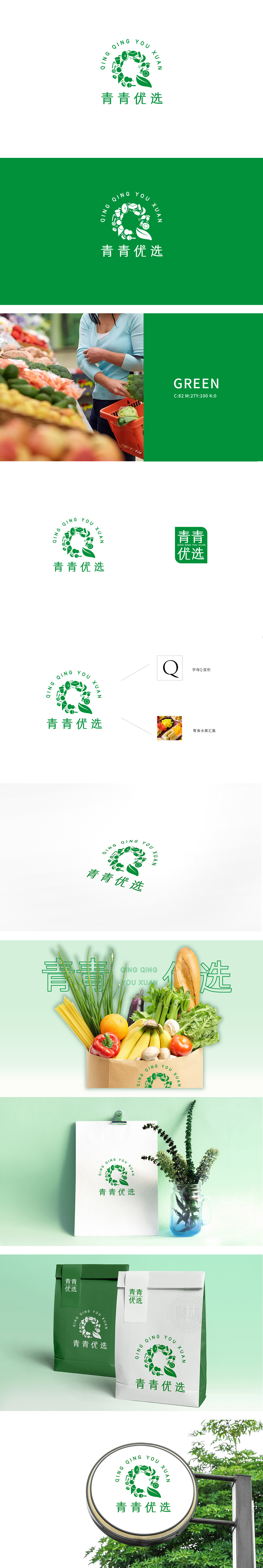
狮动设计以“Q”为骨架,既强化品牌识别度,又通过环形结构隐喻“圆满、丰富”的商超体验,品类齐全、一站式购物的便利性,环形内部填充了具象化的商品图标,涵盖多个品类:强化“优选”的品质感。 以“Q”的曲线为动线串联,形成“从自然食材到生活好物”的视觉叙事,直观告诉消费者:这里提供“生鲜+百货”的全品类精选商品。绿色主导,锚定“健康、新鲜、优选”的品牌基因,整体精准传递了“亲切、生活化”的氛围,“百货商超”的行业属性与“健康、精选、便捷”的品牌定位。
Lion design takes "Q" as the skeleton, which not only strengthens brand recognition, but also symbolizes "complete and rich" supermarket experience through the ring structure, with complete categories and convenience of one-stop shopping. The ring is filled with figurative commodity icons, covering multiple categories: strengthening the sense of quality of "optimization". With the curve of "Q" as the moving line, the visual narrative of "from natural ingredients to good things in life" is formed, which intuitively tells consumers that all kinds of selected goods of "fresh food+department store" are provided here.


扫码或拨打添加客服微信


