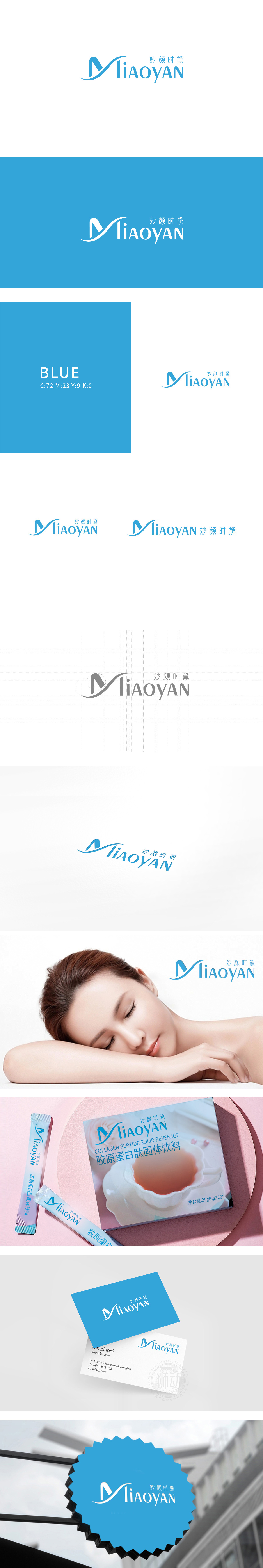
狮动设计以字母“M”为核心视觉符号,通过柔化的曲线形态构建记忆点:形成连贯的流动轨迹,仿佛液体的轻盈流动,曲线的环抱感与开放的收尾设计,既象征品牌对“多元美”的包容,也隐喻“内外兼修”的美容理念——外在呵护与内在调理的融合。通体采用低饱和度的湖蓝色,冷色调传递“清爽、纯净、科技感”,契合消费者对“无负担、天然成分”美容品的心理期待。妙”突出“精妙调理”,“颜”直指“容颜管理”,“时黛”(象征传统养颜智慧)则赋予品牌文化厚重感,暗喻“时光沉淀的美丽方案”,与美容长效养护”的定位呼应。
Lion Design takes the letter "M" as the core visual symbol, and constructs the memory point through the softened curve shape: forming a coherent flow trajectory, just like the light flow of liquid, the embracing feeling of the curve and the open ending design not only symbolize the brand's tolerance of "multiple beauty", but also symbolize the beauty concept of "both internal and external cultivation"-the integration of external care and internal conditioning. The whole body adopts lake blue with low saturation, and the cool color conveys "refreshing, pure and scientific sense", which meets the psychological expectation of consumers for "no burden, natural ingredients" beauty products.


扫码或拨打添加客服微信


