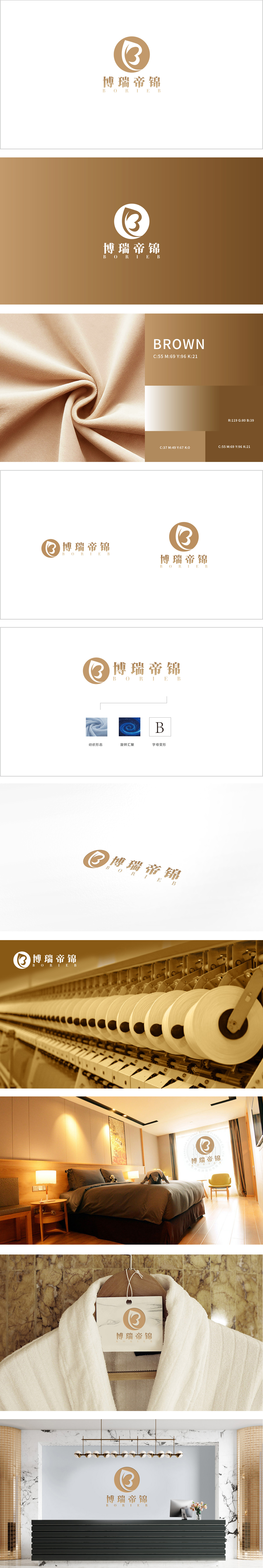
狮动设计以流动线条隐喻纺织纹理,金色圆形背景中,白色“B”字母以柔滑曲线构成,线条形态类似纺织品在拉伸、悬垂时的自然垂坠感,直观呼应纺织行业的“材质流动性”。金色传递高端、华贵感,与“帝锦”的品牌名相契合,暗示纺织产品的品质定位。整体通过“品牌符号(B字母曲线)→ 工艺隐喻(漩涡=纺纱/织纹)→ 材质实感(布料纹理)”的三层递进,完整构建了纺织行业的视觉语言体系:用线条和色彩传递品牌调性(高端、流动、工艺);完成从抽象到具象的行业叙事。
Lion design uses flowing lines as a metaphor for textile texture. On the golden circular background, the white "B" letter is composed of smooth curves, and the line shape is similar to the natural drape of textiles during stretching and drape, which intuitively echoes the "material fluidity" of textile industry. Gold conveys a sense of high-end and luxury, which is consistent with the brand name of "Dijin" and implies the quality positioning of textile products. As a whole, the visual language system of the textile industry has been built through the three-layer progression of "brand symbol (B-letter curve) → process metaphor (whirlpool = spinning/weaving) → material sense (fabric texture)".


扫码或拨打添加客服微信


