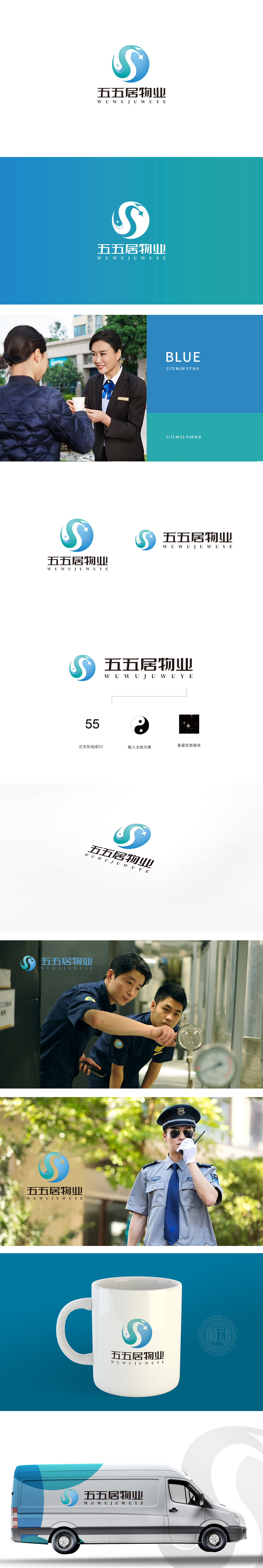
狮动设计以完整的圆形为基底,象征物业行业“周全服务、圆满守护”的核心价值,同时传递社区的和谐与凝聚力,符合居住场景对“安全、稳定”的心理需求。从浅蓝到深蓝的渐变过渡,既模拟了天空与大地的自然层次,也隐喻物业“覆盖全面、细致入微”的服务维度,色彩柔和且具有亲和力。“S”形曲线与浪花元素,既呼应品牌名称中首字母“变形,也通过浪花般的形态传递“服务如流水般持续、润泽”的理念,打破圆形的封闭感,增添活力。曲线两侧的蓝色小星形如同“点睛之笔”,象征“点亮生活、星级服务”,整体色调清新明快,符合“居住空间”的温馨定位。
Lion design is based on a complete circle, symbolizing the core value of "comprehensive service and perfect protection" in the property industry, and at the same time conveying the harmony and cohesion of the community, which meets the psychological needs of "safety and stability" in the living scene. The gradual transition from light blue to dark blue not only simulates the natural level of the sky and the earth, but also symbolizes the service dimension of "comprehensive coverage and nuance" of the property, with soft colors and affinity. The "S"-shaped curve and spray elements not only echo the deformation of the initials in the brand name.


扫码或拨打添加客服微信


