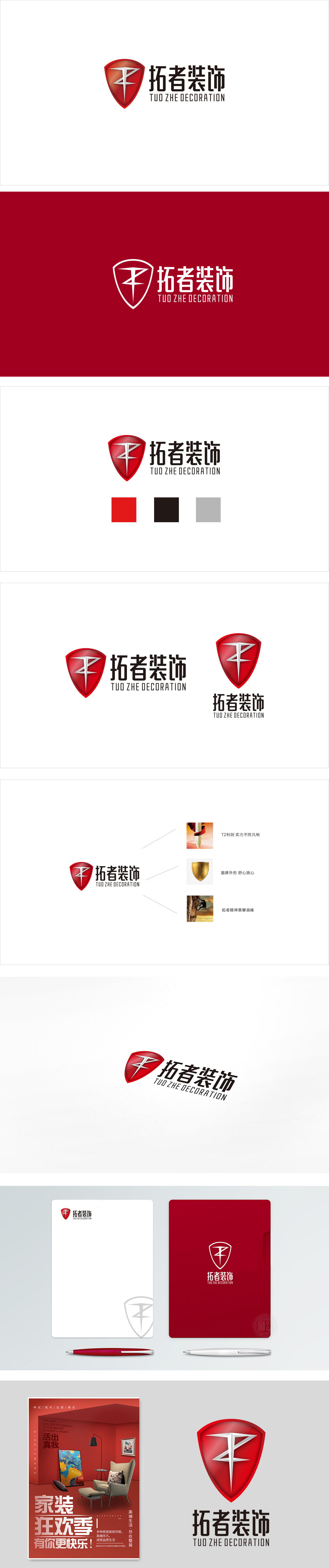
狮动设计采用符号讲“品牌故事”,红色盾牌是视觉核心,自带“可靠、保护、安全感”的心理暗示,盾牌里的白色“Z”形符号很妙:既像装饰施工中常用的工具(比如锤子、扳手的简化),又像“开拓”的箭头(呼应“拓者”的“拓”字),把“施工专业”和“品牌精神”藏进了极简的图形里,越看越有层次。中文“拓者装饰”用了粗黑的衬线字体:笔画厚重,像“夯实的地基”,符合“装饰”的“实在感”;红色:热情、活力,用色调定“品牌性格”像家的温度,符合装饰行业“温馨”的属性;。 整体把“拓者”的“开拓精神”“可靠品质”“专业能力”全揉进了图形里,好看又好实用。
Lion design uses symbols to tell "brand story", the red shield is the visual core, and it has its own psychological hint of "reliability, protection and security". The white "Z" symbol in the shield is wonderful: it is not only like the tools commonly used in decoration construction (such as the simplification of hammers and wrenches), but also like the arrow of "development" (echoing the word "extension" of "developer"). The Chinese character "Pioneer Decoration" uses a thick black serif font: the strokes are thick, like "solid foundation", which accords with the "reality" of "decoration".


扫码或拨打添加客服微信


