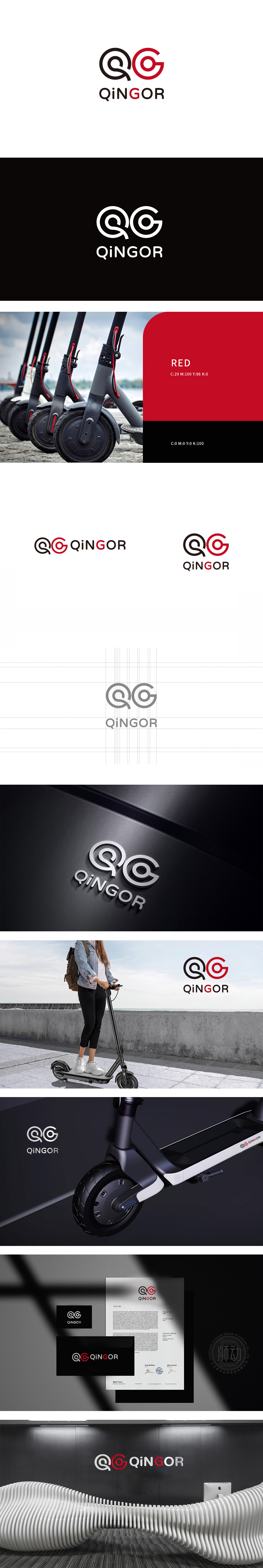
狮动设计以动态线条的“速度感”与“流动感”创作,“Q”和“G”采用了连续的环形曲线设计,黑色“Q”的尾部如惯性般延伸出流畅弧线,红色“G”则以闭合环形强化循环感,整体造型仿佛滑板车在行进中留下的轨迹。这种“无棱角”的曲线语言,直接呼应了滑板车骑行时的顺滑、灵活特性,视觉上传递出轻盈、自由的运动气质。黑色沉稳、红色亮眼的经典撞色搭配,既符合滑板车作为短途出行工具的“年轻化”定位,又通过色彩的强烈对比增强品牌记忆点,整体以“无形”传递“有形”,设计语言精准赋能产品认知。
Lion design uses the sense of speed and flow of dynamic lines, and the continuous circular curve design is adopted for Q and G. The tail of the black Q extends into a smooth arc like inertia, while the red G strengthens the sense of circulation with a closed ring, and the overall shape is like the track left by the scooter during its travel. This "non-angular" curve language directly echoes the smooth and flexible characteristics of scooter riding, and visually conveys a light and free sports temperament. The classic contrast color matching of black and bright red not only conforms to the scooter's "young" positioning as a short-distance travel tool.


扫码或拨打添加客服微信


